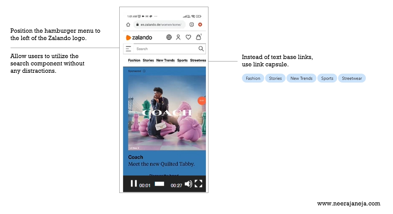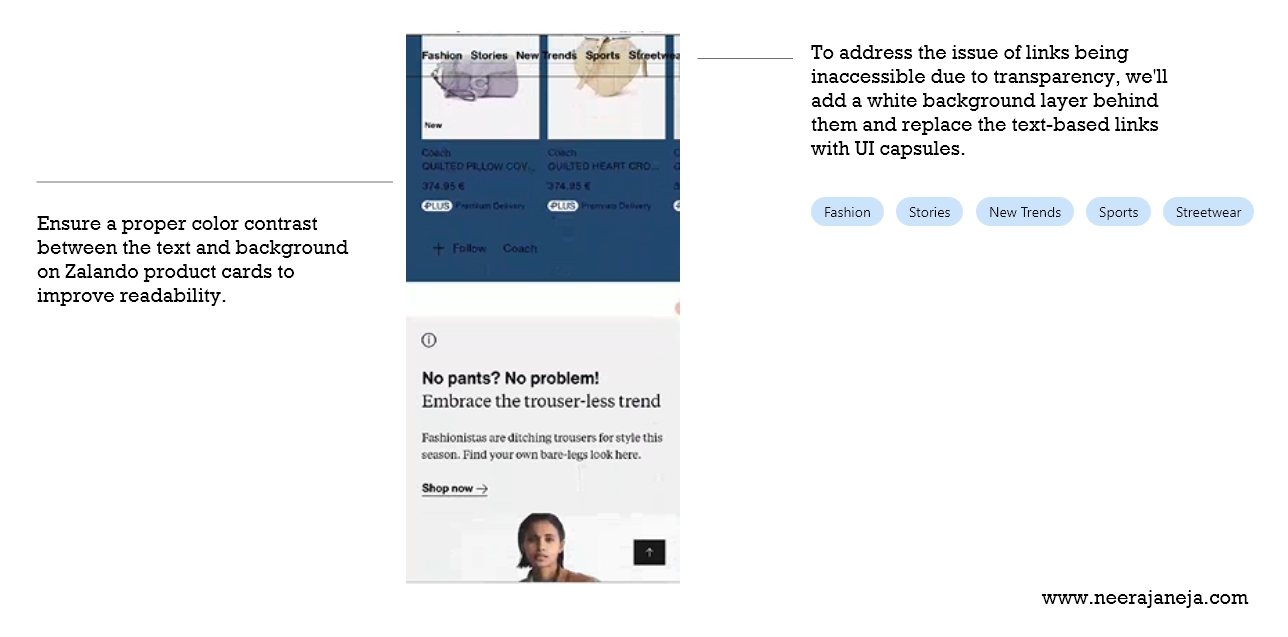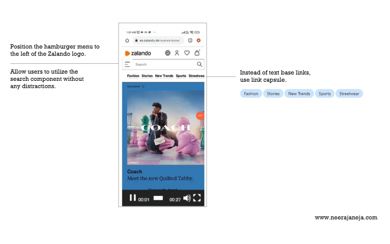
I visited the website Zalando noticed few UI issue, where I noticed text-based links at the top of the page. Text-based links are typically utilized within content for cross-linking to other pages. In this instance, we aim to encourage users to explore our categories and subcategories, which should be highlighted prominently. Presenting them solely as simple text-based links may not effectively capture users’ attention. I would recommend transforming these links into capsule UI format to enhance their aesthetic appeal and visual prominence. Capsule links provide a clear indication of the clickable area and are visually appealing, attracting users’ attention.
Website : zalando.de
Page : Home page
Reason: Capsule UI links enhanced Clickability and provide touch of modernity and sophistication to the website’s design.
Success criteria : Monitor the percentage of users who click on the capsule UI links compared to the previous text-based links.
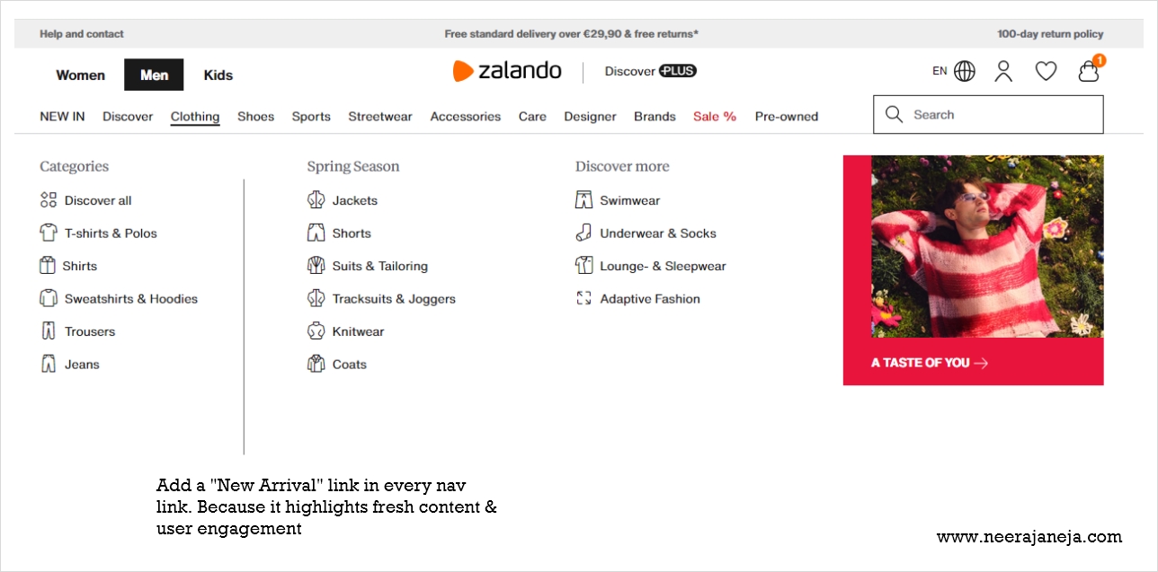
Note : Implement this in all categories/ subcategories in all pages to maintain consistency. Consistency in design elements across the website indicates successful implementation.
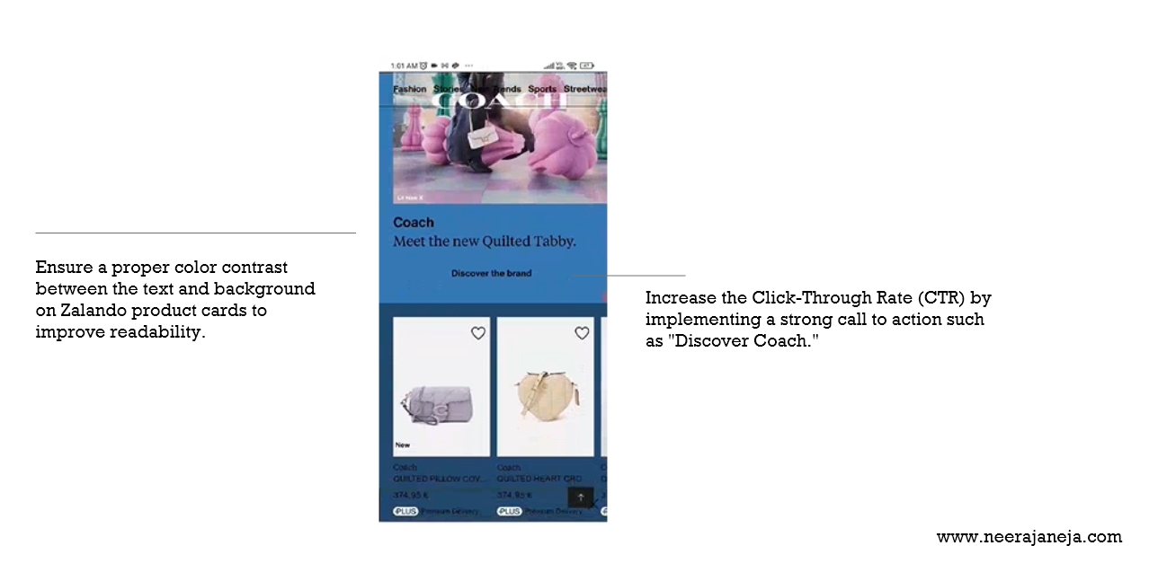
Current user interface of zolando.de
Please refer these screenshots.


