During my visit to the Zalando website’s Product Detail Page (PDP), I observed several UX enhancements. As an e-commerce product designer, I’m sharing some PDP issues and recommendations on my website, neerajaneja.com.
Website : https://en.zalando.de/
Page : https://en.zalando.de/valentino-bags-leith-handbag-naturalecuoio-5va51h1dk-b11.html
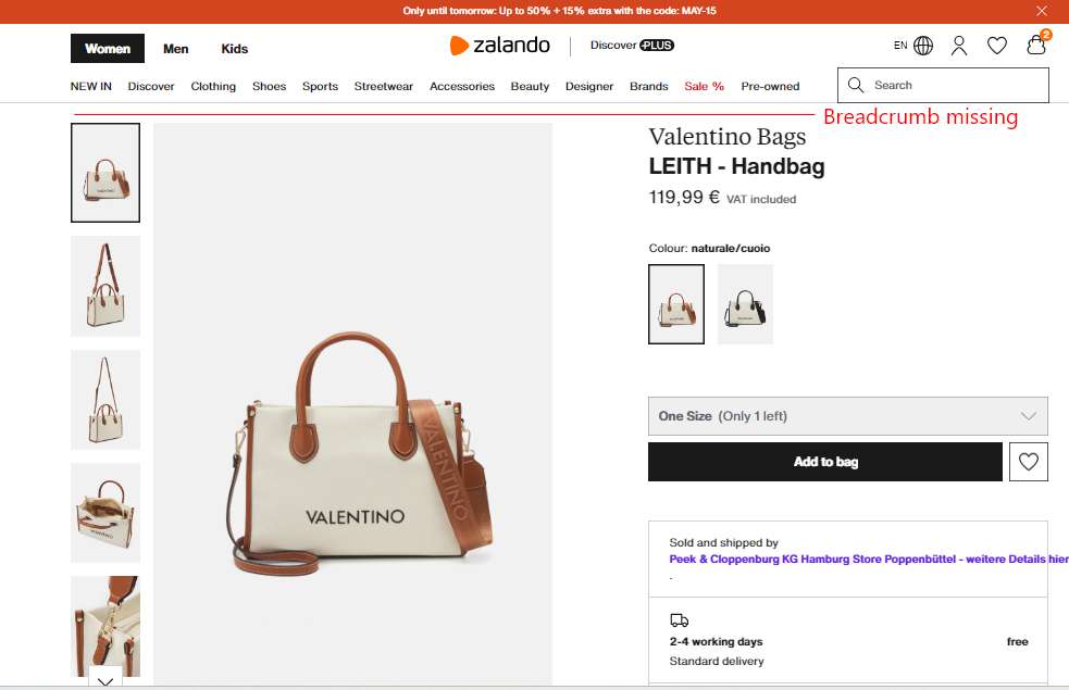
Issue : Missing breadcrumb
Missing breadcrumb
Rohan, a 35-year-old marketing professional looking for a gift for his wife on an e-commerce website.
Scenario
Rohan stumbles upon a beautiful Valentino LEITH Handbag while browsing the website. He clicks on it to see the product details page (PDP) but immediately notices the absence of a breadcrumb navigation bar.
Internal monologue of Rohan
“This Valentino bag looks amazing! But wait, where am I on the website? Was this under designer bags or handbags? Let’s see if I can find it in the menu.”
Actions
Confused by the lack of context, Rohan spends time searching for the category hierarchy. He checks the side navigation bar and explores the website menu to understand where this particular Valentino bag sits within the website’s structure.
Resolution
The website should implement a proper breadcrumb navigation system on the PDP. This would allow Rohan and other users to understand the product location, easy navigation and improve user experience.
Know more about Breadcrumb here
https://baymard.com/blog/ecommerce-breadcrumbs
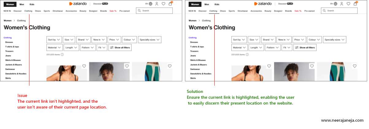
2. Current link is not active or highlighted
 By highlighting the current link the user can instantly see his location within the website’s structure. This eliminates any confusion about where the Valentino LEITH Handbag falls in the navigation hierarchy.


