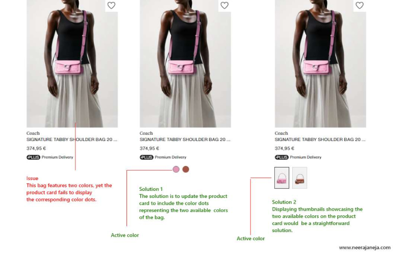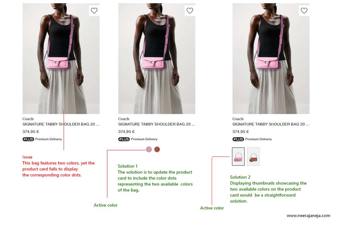
While reviewing the product category page on zalando.de, I noticed a few UX issues. Although they may seem small, they contribute to increased visual and motor load. As product designers, our goal is to ensure a smooth and easy user journey. I’m sharing the identified problems along with their solutions. I kindly ask the Zalando team to address these minor issues.
Issues and recommendations for zalando.de product cards
Displaying available color variations upfront reduces the motor load, sparing users the need to navigate to the PDP page to view the product’s color options. By presenting them here, users can swiftly discern their choices and proceed directly to the desired PDP page for purchase.


