UX & Design Issues in Opendoor.com A Product Designer’s Analysis
As a UX and product designer, I recently explored Opendoor.com and identified several UX & Design Issues that could impact user experience and conversion rates. In this analysis, I break down key usability issues, suggest improvements, and highlight opportunities for a more seamless digital experience. As part of a usability testing exercise, I conducted a heuristic evaluation of Opendoor.com to identify key UX issues affecting user experience and functionality. This analysis uncovers usability challenges and provides insights for improvement. Read the full breakdown on neerajaneja.com.
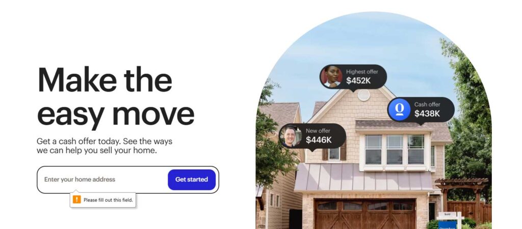
Issue: Unclear error message in the address field. Heuristic Violated: Error Prevention (#5), Help Users Recognize & Recover from Errors (#9). Severity: Medium – causes confusion but doesn’t block progress. Causes: No real-time validation. Solution: Add real-time validation
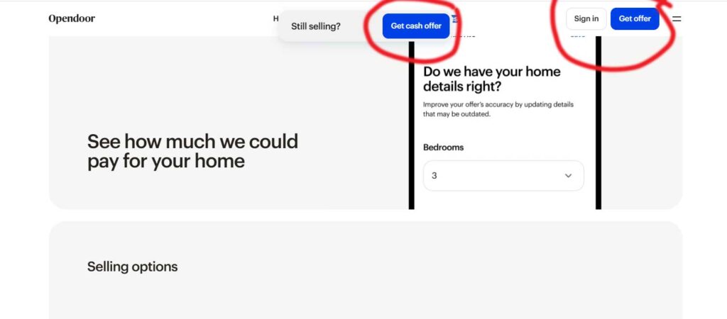
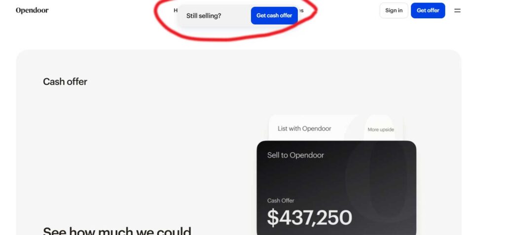
Issue: The page displays two similar CTAs—“Get Offer” and “Get Cash Offer”—causing user confusion. Heuristic Violated: Recognition Rather Than Recall (#6). Severity:High – Users may struggle to choose the right option, reducing conversions. Causes: Similar wording, lack of explanation Solution: Hide “Get Offer” On Scroll
Issue: The floating button overlaps the primary navigation, obstructing access to key menu items. Heuristic Violated: Visibility of System Status (#1), Flexibility and Efficiency of Use (#7). Severity: High – Blocks essential navigation Causes: Incorrect button placement, lack of responsive design, and no option to dismiss or reposition the button. Solution: Adjust button placement to avoid overlap, and allow users to minimize or move the button if needed.
Issue: The address field accepts dummy text, allowing users to input invalid or fake addresses. Heuristic Violated: Error Prevention (#5), Data Validation & Error Handling (#9). Severity: High – Can lead to incorrect data Causes: lack of input validation, no real-time verification, and absence of format constraints. Solution: Implement address validation using regex or third-party APIs, restrict dummy inputs, and provide real-time error messages for invalid entries.
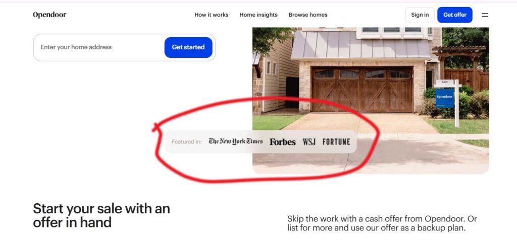
Issue: Media logos (e.g., “Featured in The New York Times”) are not linked, reducing credibility. Heuristic Violated: Visibility of System Status (#1) Severity: Medium – Users expect clickable links for verification. Causes: Static images without links or context. Solution: Add links to original sources, use tooltips or captions for clarity.
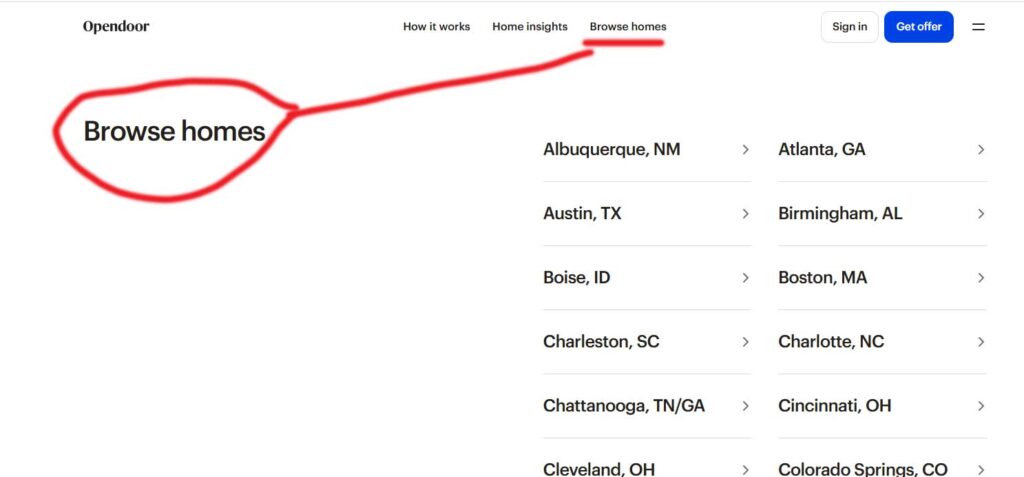
Issue: No highlight for the current navigation item, causing disorientation. Heuristic Violated: Visibility of system status (#1), Recognition rather than recall (#6). Severity: Medium Causes: Missing visual indicator for the active page. Solution: Use color, underline, or bold text to highlight the active nav item.
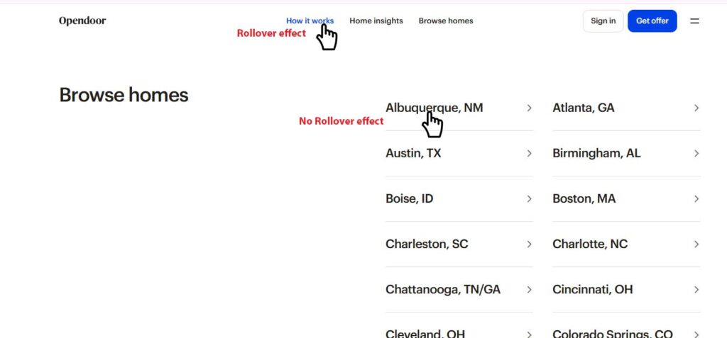
Issue: Link hover effect is inconsistent—changes in navigation but not on the listing page. Heuristic Violated: Consistency and Standards (#4). Severity: Medium – Inconsistent behavior can confuse users and reduce usability. Causes: Missing or inconsistent hover styles in the listing page. Solution: Ensure uniform hover effects across all links for a consistent user experience.
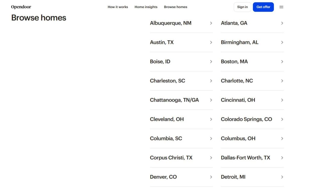
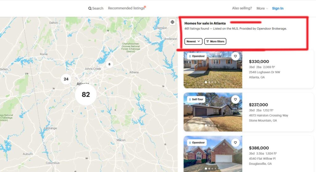
Issue: Users must scroll through a long list to find their location, with no search option available. Heuristic Violated: Flexibility and Efficiency of Use (#7), Visibility of System Status (#1). Severity: High – Increases user effort and frustration, especially for long lists. Causes: Lack of a search bar, no filtering or quick navigation options. Solution: Add a search bar, enable alphabetical filtering, or implement a dropdown with autocomplete to improve usability.
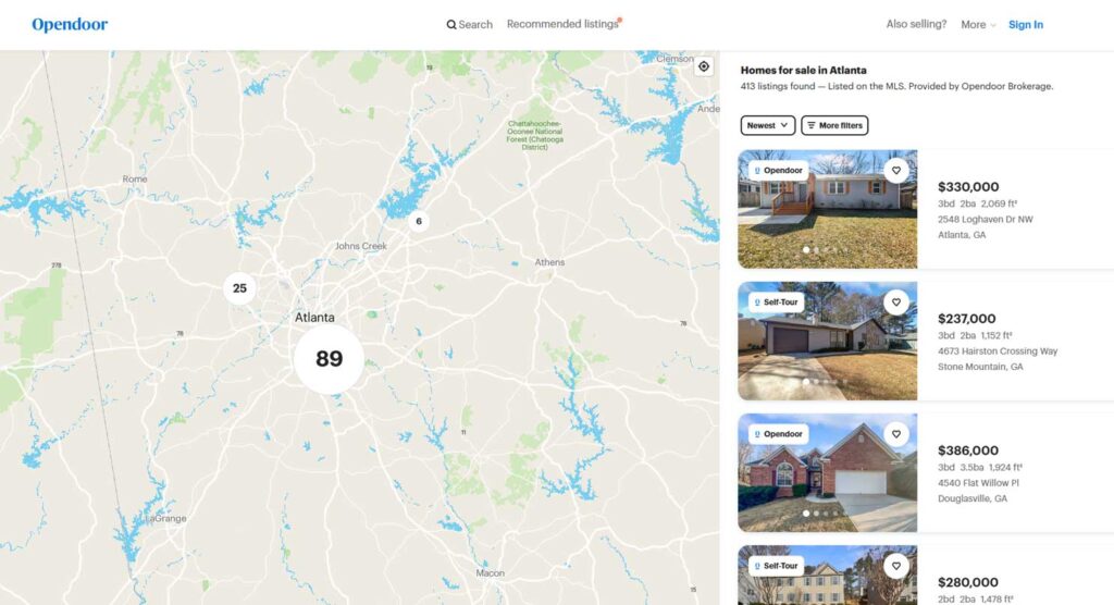
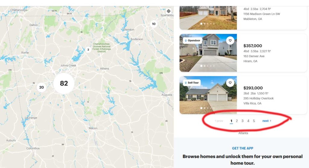
Issue: No option to navigate back to the listing page after selecting Atlanta, GA (missing breadcrumb navigation). Heuristic Violated: User control and freedom (#3), Visibility of system status (#1). Severity: High – Users may feel stuck or frustrated without an easy way to return. Causes: Missing breadcrumb navigation, no clear “Back to Listings” button. Solution: Add breadcrumb navigation (e.g., Home > Browse Homes > Atlanta, GA)
Issue: Pagination is only at the bottom, requiring excessive scrolling for navigation. Heuristic Violated: User control and freedom (#3), Flexibility and efficiency of use (#7). Severity: Medium – Inconvenient for users, especially with long lists. Causes: Limited pagination placement, no alternative navigation options. Solution: Add pagination at the top, implement lazy loading for seamless scrolling, or use an infinite scroll with a “Load More” button for better UX.
Issue: Pagination is only at the bottom, requiring excessive scrolling for navigation. Heuristic Violated: User control and freedom (#3), Flexibility and efficiency of use (#7). Severity: Medium – Inconvenient for users, especially with long lists. Causes: Limited pagination placement, no alternative navigation options. Solution: Add pagination at the top, implement lazy loading for seamless scrolling, or use an infinite scroll with a “Load More” button for better UX.
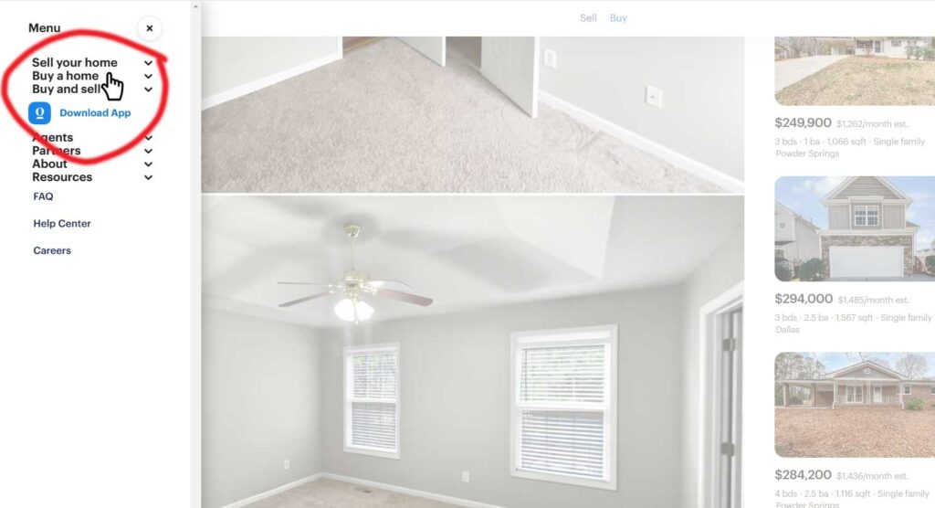
Issue: Hamburger menu links are congested, making it hard to identify the selected link. Heuristic Violated: Visibility of System Status (#1), Error Prevention (#5), and Aesthetic and Minimalist Design (#8). Severity: High Causes: No line height for spacing, no visual highlight for selected links. Solution: Provide top and bottom space for better readability, add hover state for selected feedback
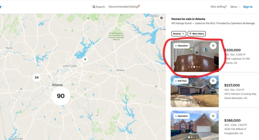
Issue: Listing images lack an image count, leading to endless clicking on navigation arrows. Heuristic Violated: Visibility of system status (#1), User Control and Freedom (#3). Severity: Medium – Users may get frustrated not knowing the total images. Causes: No indicator for total images or current image position. Solution: Add image count (e.g., 1/10)
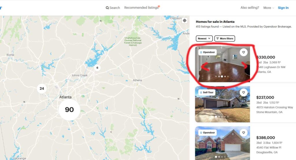
Issue: Navigation arrows are only visible on rollover, while dots are always visible, causing inconsistency. Heuristic Violated: Consistency and Standards (#4), Visibility of System Status (#1). Severity: Medium – Users may not realize arrows exist, leading to confusion. Causes: Inconsistent visibility between arrows and dots, lack of clear navigation controls. Solution: Make arrows always visible or ensure users understand they can navigate using dots.
Issue: No option to change the listing while on the Atlanta detail page. Heuristic Violated: User Control and Freedom (#3) Severity: High Causes: Missing dropdown, filter, or navigation to switch listings. Solution: Add a “Change Location” dropdown, a breadcrumb trail, or a “See Other Cities” section for easy navigation.
Issue: No option to change the listing while on the Atlanta detail page. Heuristic Violated: User Control and Freedom (#3) Severity: High Causes: Missing dropdown, filter, or navigation to switch listings. Solution: Add a “Change Location” dropdown, a breadcrumb trail, or a “See Other Cities” section for easy navigation.
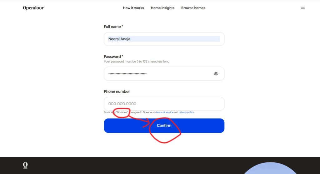
Issue: Button label says “Confirm”, but text says “Continue”, causing confusion. Heuristic Violated: Consistency and Standards (#4). Severity: Medium – Users may be unsure about the action. Solution: Rename the button to “Continue” or update the text to match “Confirm”.
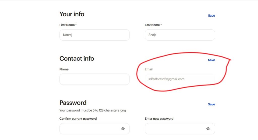
Issue: No option to change the email ID in the My Account section. Heuristic Violated: User Control and Freedom (#3). Severity: High – Users feel restricted if they cannot update their email. Solution: Provide an option to update email, with verification for security.
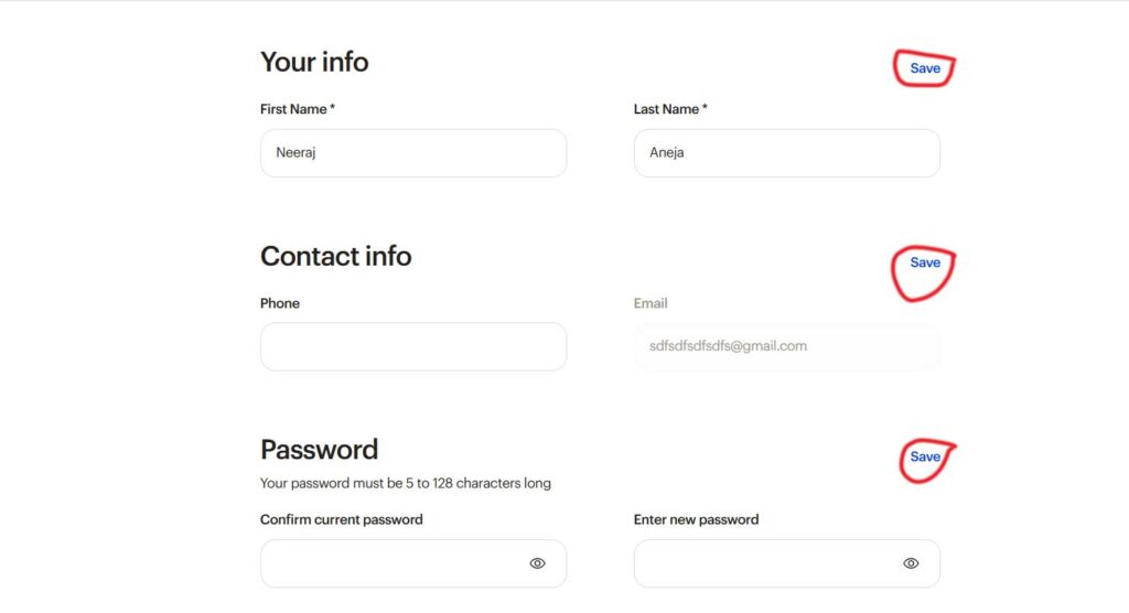
Issue: The Save button is active by default, even when no changes are made. Heuristic Violated: Error Prevention (#5) Severity: Medium – Users may think they made changes when they haven’t. Solution: Disable the Save button until a change is detected, or provide an Edit button before allowing modifications.
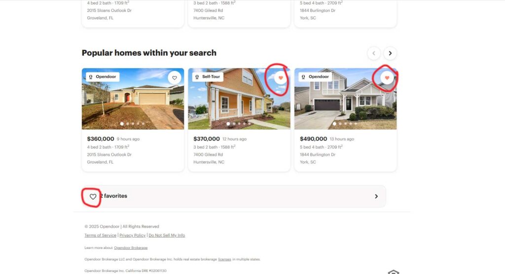
Issue: The favorite heart icon is not filled, despite adding products to favorites, while images show it correctly. Heuristic Violated: Visibility of System Status (#1), Consistency and Standards (#4). Severity: Medium – Users may think their action wasn’t registered. Solution: Ensure the heart icon updates in real-time when a product is favorited for consistency across the UI.
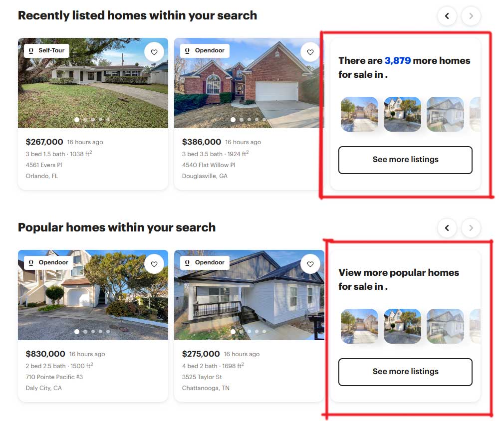
Issue: “See More Listings” CTA is hidden inside the slider, making it hard to find. Heuristic Violated: Visibility of system status (#1), User Control and Freedom (#3). Severity: High – Users may not realize more listings are available. Solution: Place the CTA outside the slider, make it always visible, or add a clear indication of more content.