The signup flow isn’t just another step in applications or websites; it’s the critical gateway welcoming new users into your digital experience. It acts as the open door, inviting curious individuals to become part of your vibrant community and discover the value you offer.
More signups translate to a larger user base, which unlocks exciting revenue potential. Think of it as a direct investment in your website’s traffic and financial health. By streamlining and optimizing this crucial flow, you empower users to effortlessly join your platform, ultimately generating valuable leads that fuel your growth.
How to design better signup screen?
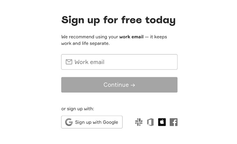
– Streamline the signup process for a quick and painless experience.
– Offer social media login options for effortless access with familiar credentials.
– Change the button color (e.g., Submit/Continue) based on completed input fields to provide clear visual feedback.
– Validate field data instantly as users type, displaying error messages in real-time to catch mistakes early.
– Provide clear visual cues for successful and focused input fields to guide users through the process.
– Enable a password visibility option to allow users to check their typed password and avoid typos.
Advance tips while designing Signup screen
– Always keep input box labels visible.
– Obtain user acceptance of legal and privacy terms.
– Offer seamless switching between signup and login pages.
– Place a “Forgot Password” option below the password field.
– For financial applications, provide feedback on password strength with suggestions for improvement.
Keep signup flow simple and intuitive to convert users to members as quickly as possible.
Example

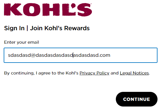
The signup process on Kohls.com does not provide immediate validation for the email ID as it is being typed, which deviates from optimal UX practices.


