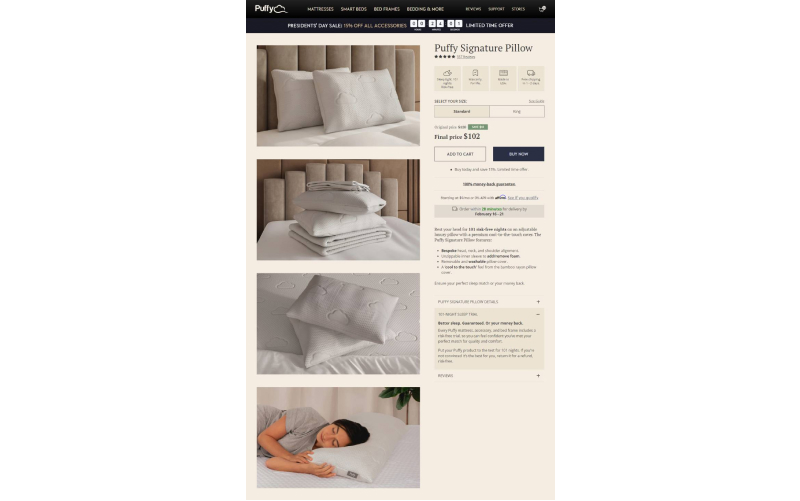
Puffy.com, a mattress company based in Dubai, boasts a visually stunning and elegant website. However, despite its aesthetic appeal, it lacks several key features crucial for a successful e-commerce platform. Today, on Neerajaneja.com, I’ll review Puffy’s website and identify growth opportunities it can leverage.
For any e-commerce site, the first step is to acquire customer email IDs and convert regular users into members. After collecting email addresses and other relevant information, the system can send targeted email campaigns to nurture leads and convert them into buyers.
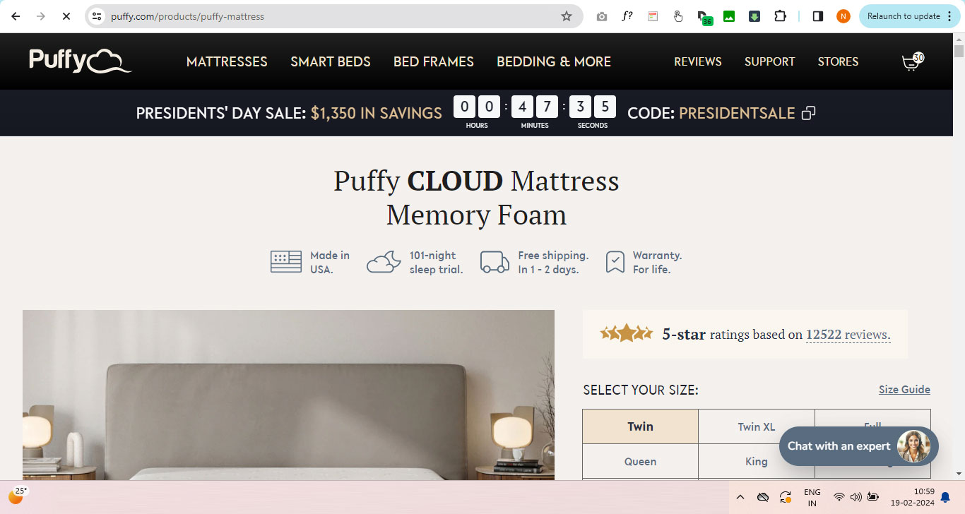
However, Puffy currently lacks Login and Register links in the header, making it difficult for users to create accounts and participate in member benefits. As an e-commerce product designer and growth expert, I recommend introducing clear and easily accessible Login and Register links in the header.
Additionally, offering a 10% discount on the first purchase can incentivize user registration. By utilizing the AIDA principle (Acquisition, Interest, Desire, Action) in your email marketing efforts, you can effectively guide users through the customer journey and increase conversion rates.
Acquisition + Interest + Desire + Action = Conversion (Sale)
Missing attributes at Information Architecture level
– Breadcrumb
– Product color
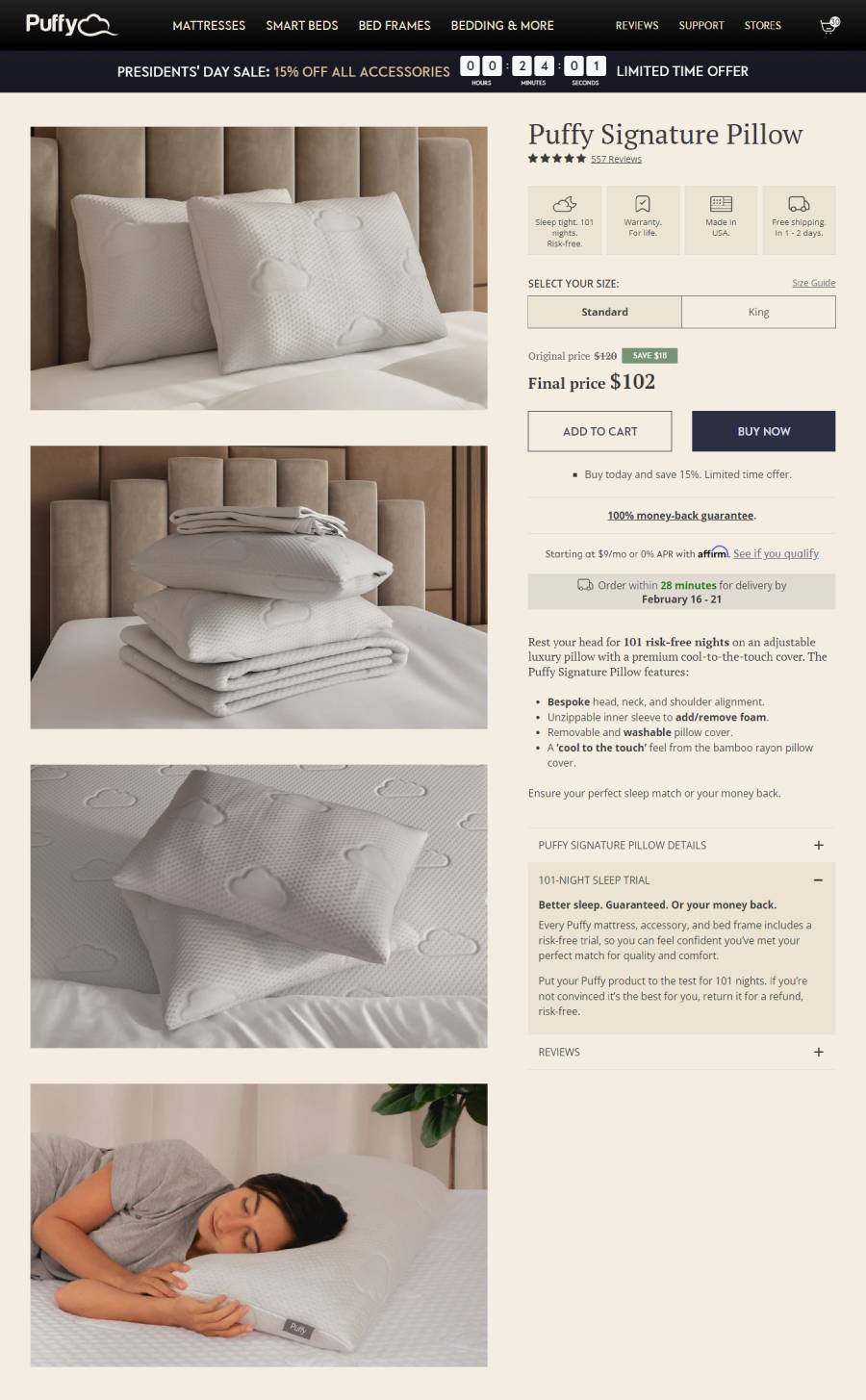
– Product information is not visible in the first fold of the page. Users have to scroll down to see the information. It is recommended to display important information, such as made and filling quality, in the first fold of the page.
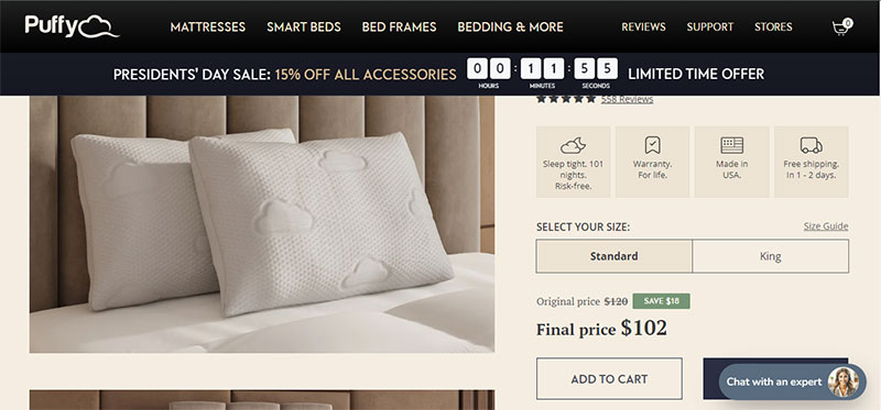
– Fabric quality of the pillow is not mentioned in the first fold of the page. As a user, I want to know the fabric and filling material quality of this pillow.
– Firmness level is not provided.
– Best sleeping position for this pillow is not provided on the detail page.
Missing attributes at SEO Level
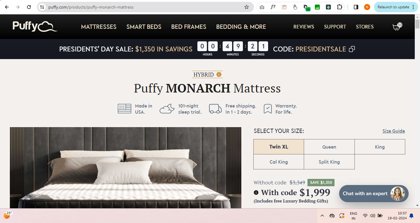
https://puffy.com/products/puffy-monarch-mattress
1. The Puffy MONARCH Mattress does not appear in the top 5 results on Google when searching for the keyword “MONARCH Mattress.”
2. The Puffy site is not targetting “Semantic Keywords” like
– Monarch mattress in usa reviews
– Monarch mattress in usa price
– Monarch mattress in usa king size
– Best monarch mattress in usa
– monarch mattress reviews
Puffy Monarch mattress page is not coming in top 10 on these keywords.
Recommendations:
As a product designer, my objective is to implement a strategy to ensure that the Puffy Monarch mattress page ranks within the top 5 results for all relevant Monarch mattress keywords.
Note : Same applies for all other product pages as well.
Blank Space
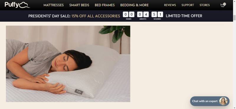
The image is dispaying the the right side blank area. User can lost context here.
–
My memory is weak

Unfortunately, my memory isn’t strong either, and I can’t recall the size chart I saw previously. It would be incredibly helpful if the system displayed the size options at this view also. This would allow users to easily view the dimensions of the pillows without needing to search elsewhere.
Engage users on the Puffy Product Detail Page (PDP) with these features:
– Recently Viewed Products
– Bundle Product Section
– Customers Who Bought This Also Bought
– and many more.
First fold of the page on Puffy Website of all mattresses
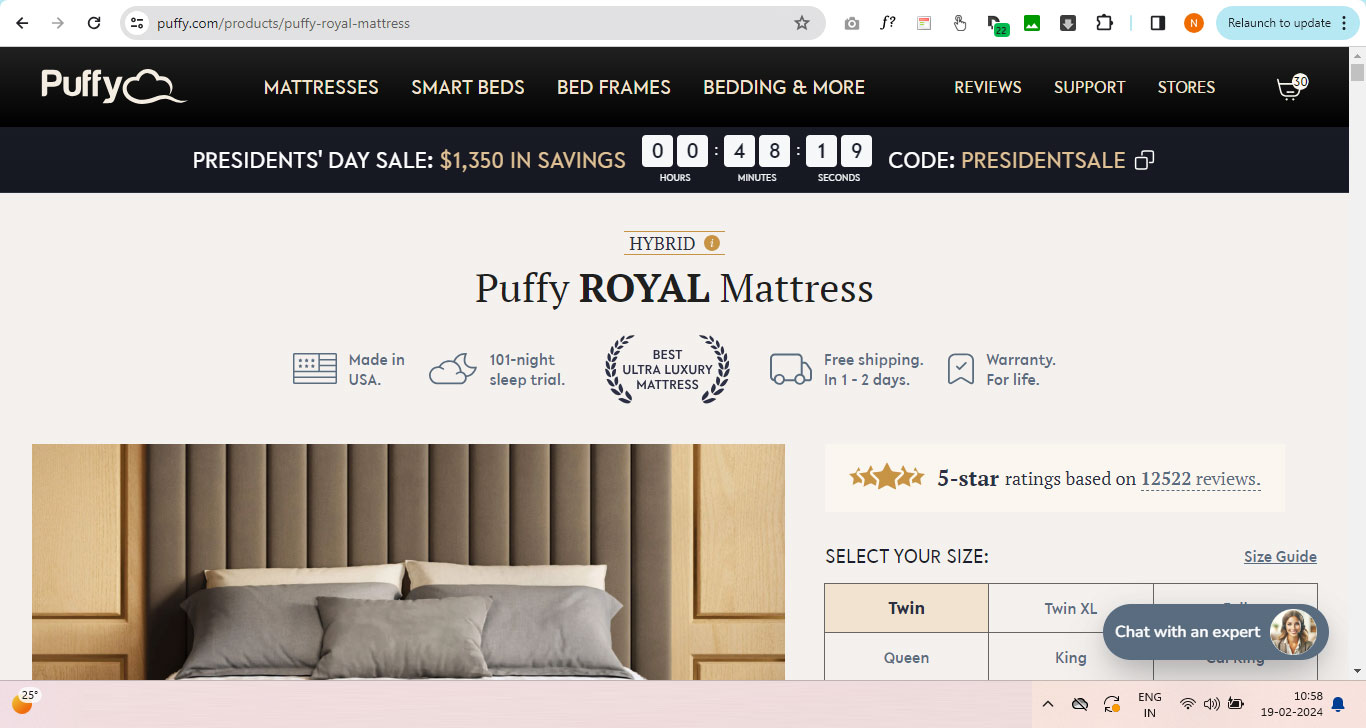
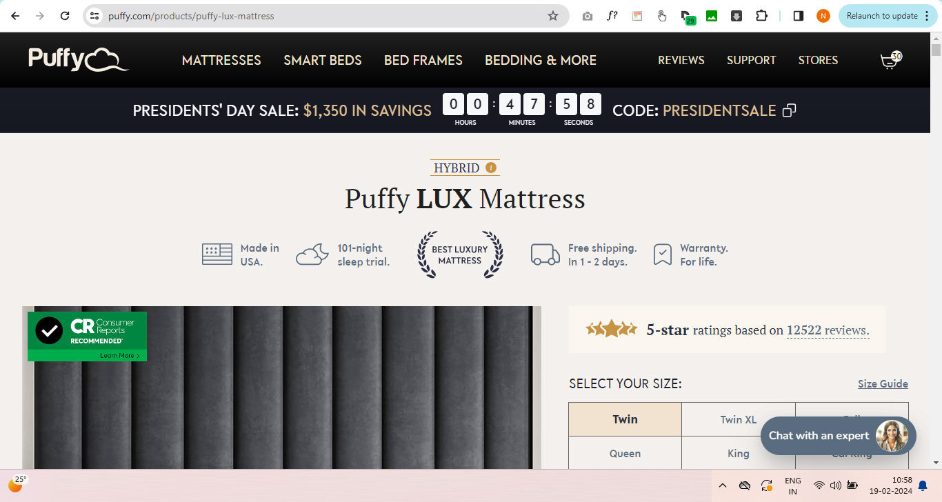
Please observe closely: Users should only see the product title in the initial view of all mattress pages. The system needs to showcase key points about each mattress within this initial view.
The display lacks the More Points System.
https://puffy.com/products/puffy-pillow
The page fails to indicate the quantity of pillows included in a single order. This information is not readily visible in the initial view of the page. As a user, I attempted to locate this data but it is not presented upfront for clear visibility.
Checkout Journey at Puffy
1. Affirm option is given at bottom only. Give this option at top also with Cart Total amount.
![]()
2. There is no option to increase the quantity of free items puffy is giving with mattress. As a buyer I want to increase the quantity of pilows. Puffy can charge extra amount for extra pillows. We have to solve this used case as well.

3. Help user to find the best mattress by asking few questions in the survey form.
Sleep Habits and Preferences:
How many hours of sleep do you typically get each night?
Do you tend to sleep on your back, stomach, side, or a combination?
Do you have any specific sleep issues, such as back pain or snoring?
Do you prefer a firm, medium, or soft mattress?
Do you sleep hot or cold?
Do you share your bed with a partner or pets?
How satisfied are you with your current mattress?
What do you like most about your current mattress?
What do you dislike most about your current mattress?
How long have you had your current mattress?
Brand and Marketing Preferences:
Are you familiar with any mattress brands? If yes, which ones?
How important is brand reputation when considering a mattress purchase?
Do you tend to trust online reviews when researching mattresses?
Health and Body Considerations:
Do you have any specific health concerns or conditions that affect your sleep?
Are you looking for a mattress that can help alleviate any specific health issues, such as back pain or pressure points?
What is your weight range? (Some mattresses are better suited for different weight ranges)
Videos Section
Create video section page or video widget on the home pages to engaze user.
– Videos demonstrating mattress packing and unpacking
– There are no keywords associated with optimal sleep quality.
– Despite “Best Night Sleep” yielding 732 million results, Puffy isn’t focusing on this keyword. This highlights a deficiency in Puffy’s keyword targeting strategy.
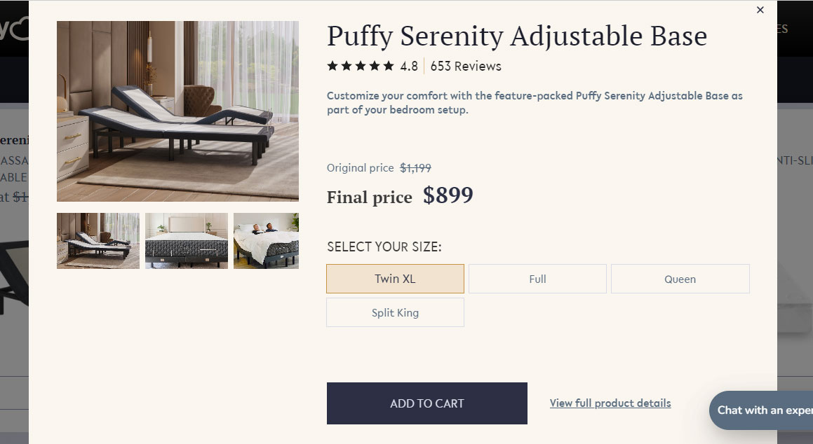
The overlay is failing to show the size specifications.
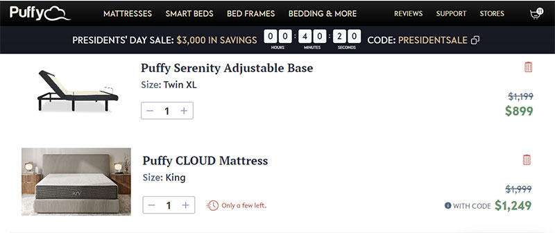
The added product in the cart isn’t showing the amount the buyer is saving.
The clarity of the price before and after applying the coupon is not apparent to the buyer.
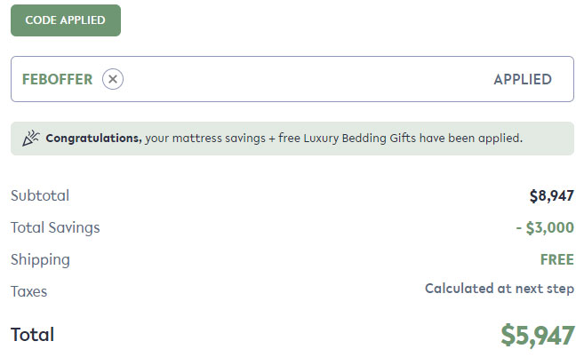
It’s unclear to the user how much they’ve saved after applying the coupon.
Reduce width of “Chat an Expert” as this is overlapping the “BUY NOW” Button at many places.
Make “Product Name” Clickable and reach user to its landing page in Promotional text

Create clickable promotional text directing users to the landing page of the “Product Name” for an enhanced shopping experience.
Display Comparison chart .
Furthermore, Puffy can exhibit comparisons with other mattresses (Casper,Nectar, Purple) etc on the market. What makes Puffy worth purchasing?


