Today, we’ll assess the navigation of the puffy.com website. Let’s begin by examining the existing structure.

Puffy Navigation UX Review
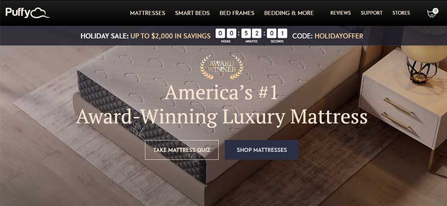
On puffy.com, there is a practice of presenting secondary navigation links alongside primary navigation. However, for optimal user experience, it is advisable to separate primary and secondary navigation, ensuring that users can distinctly focus on the primary navigation without any mixing of secondary elements.

Primary vs Secondary Navigation in Puffy.com
The primary navigation links are
– MATTRESSES
– SMART BEDS
– BED FRAMES
– BEDDING & MORE
Secondary Navigation Links are
– REVIEWS
– STORE
– SUPPORT
UX guidelines to display Primary and Secondary Navigation
Primary navigation is the main navigation interface on a website. It links to the most important website pages and appears prominently at the top of the homepage and other pages.
Secondary Navigation
Secondary navigation comprises the links to content that is less important than primary pages, but should still be easily accessible from any location on the site.
However, the Puffy website currently displays both primary and secondary navigation links in the same prominent location. It’s recommended that this prominent space be reserved exclusively for primary navigation link items.
Let’s examine how competitors display both primary and secondary navigation link items.

Macys.com prominently showcases primary navigation links in a prominent location. Additionally, Macy’s has categorized the links into primary and secondary, allowing users to easily scan and distinguish between main links and supporting links.

Amazon.com, the renowned e-commerce platform, has strategically organized its links into primary and secondary navigation categories.
Title case vs upper case letters in navigation links
The Puffy.com website displays all navigation system links in uppercase, making it challenging for users to read and scan. To adhere to the best UX practices, it is recommended to present navigation links in title case for improved readability and user experience.
Conclusion
To enhance user experience, categorize navigation items into primary and secondary links. Prioritize user focus on main links to improve conversion rates.


