Today, on neerajaneja.com, I’ll discuss the essential user interface elements that every ecommerce website ought to incorporate. These fundamental UI components are crucial for enhancing user experience and facilitating smooth user flow. I’ll be using puffy.com as a reference for our analysis, focusing on key aspects.
No option of Login/ My Account on Puffy Website
Upon closer inspection, I, as a registered user, couldn’t find an option to log in and view the products I’ve ordered. It’s imperative to distinguish between primary and secondary navigation elements. Additionally, a search input box is essential for users to input their queries easily. Other crucial elements include tracking orders, a store locator that auto-detects the user’s PIN code, and displays the nearest available store, a hero image conveying useful information, and primary and secondary calls to action on the hero image.
And there’s more to consider.
First fold of the page
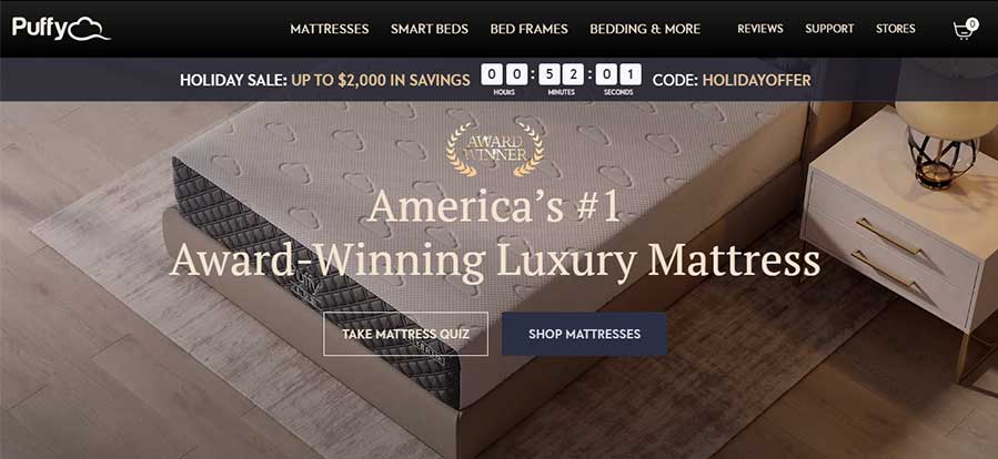
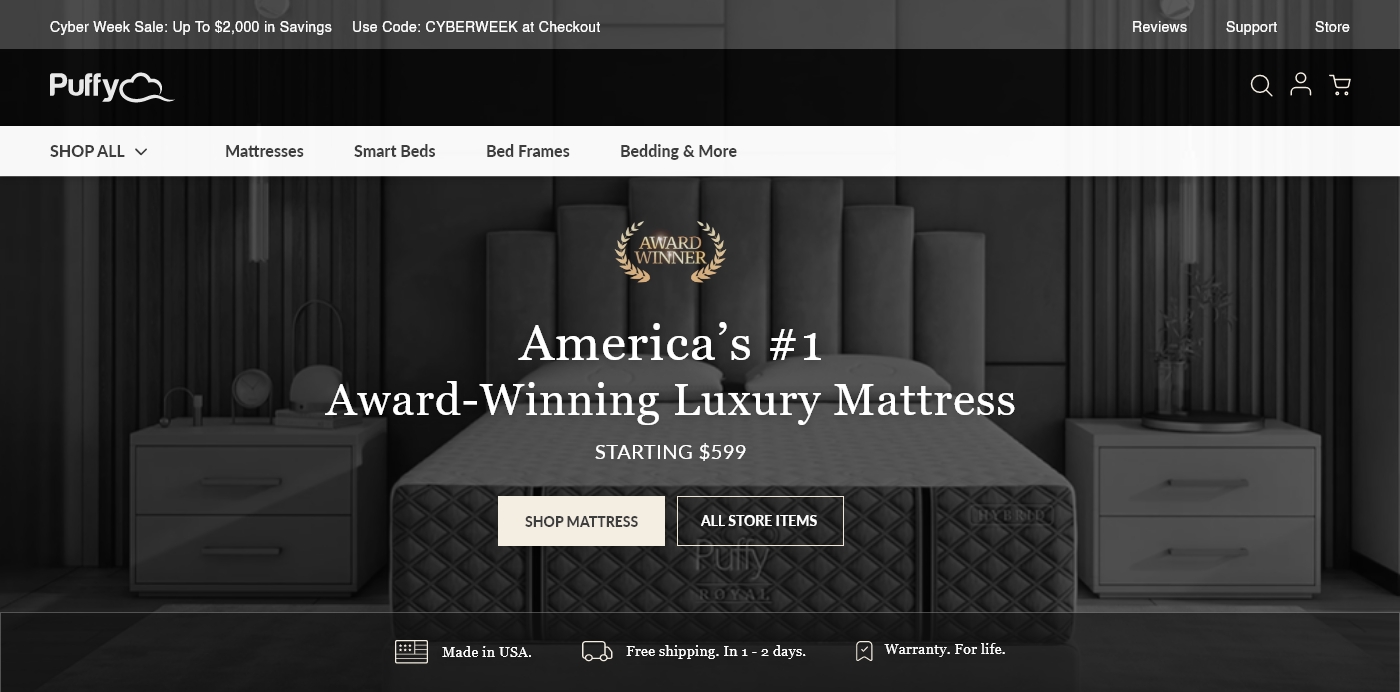
Now, let’s delve into what the home page of “Puffy.com” currently presents. Our focus will be on the first fold of the page. Please take a look at the current screenshot of the puffy.com homepage:

Upon examination, I observed several missing elements on the Puffy home page that could significantly enhance conversion rates and user experience. To address this, I propose incorporating the following elements in the header and on the hero image:

Prototype with my Recommendation for better conversion.
Product Section on Puffy Home Page

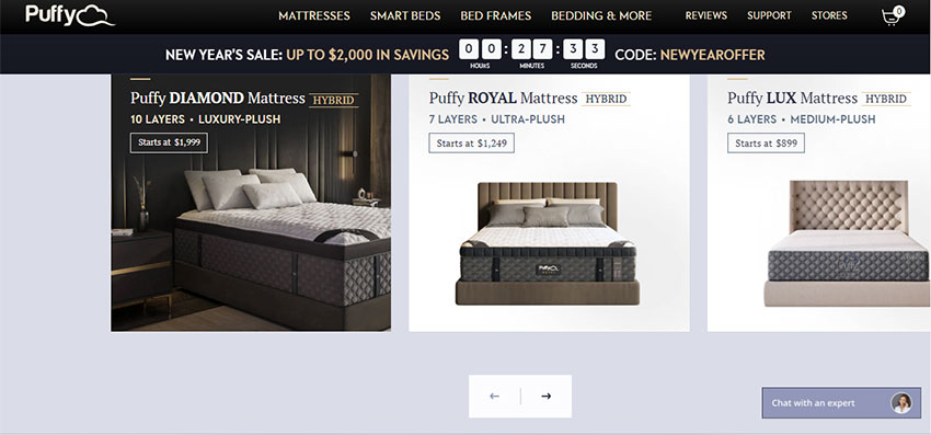
This segment on the Puffy website features a total of four products, with three already visible. Currently, the system utilizes the scroll feature solely to showcase an additional item, unnecessarily increasing the motor load. As a UX designer, my recommendation is to employ scrolling only when essential and to avoid incorporating UI patterns that are not needed.


