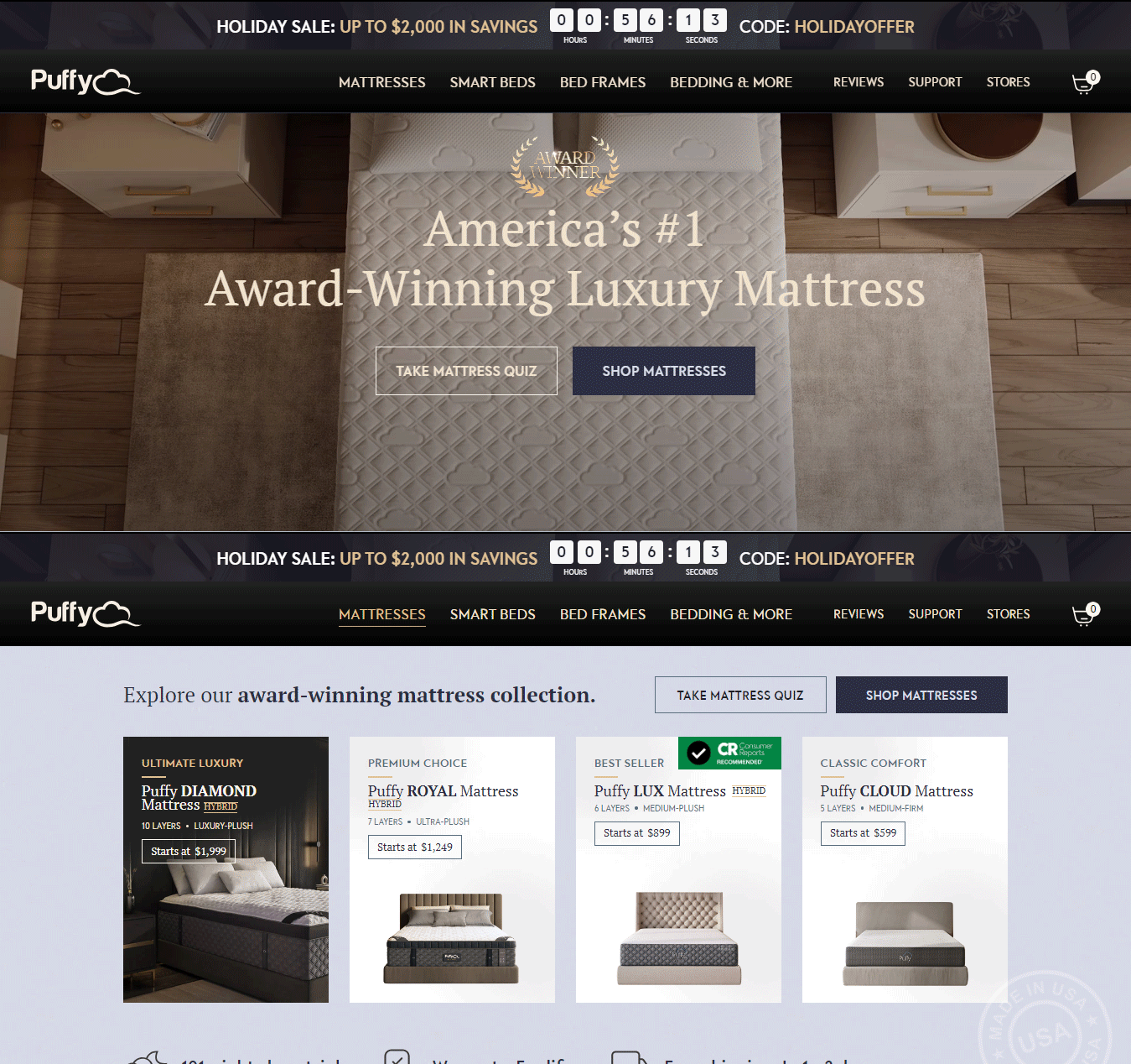
Today, at neerajaneja.com I will explore the positioning of promotional messages on websites, using puffy.com as a case study. While it may appear to be a minor aspect, the placement of these messages can have a substantial impact on the user journey and overall user experience. Join me as we delve into the detailed review of puffy.com’s promotion message placement.
Placement of Promotional Message on website
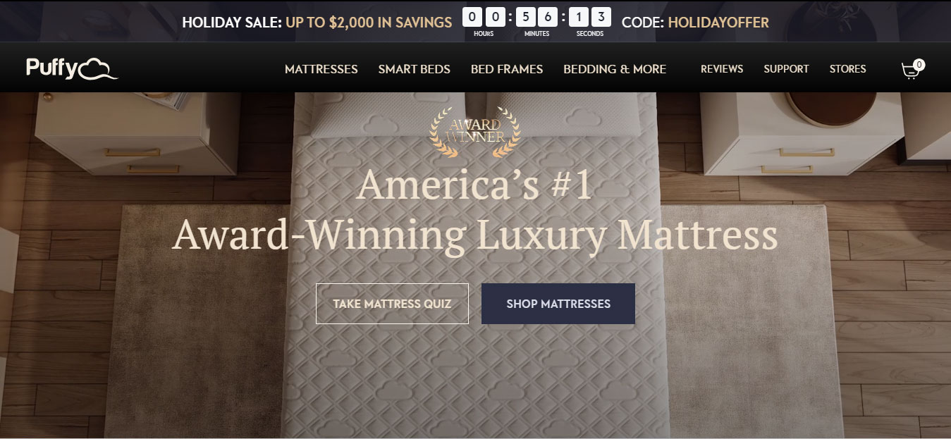
On the homepage of puffy.com, the promotional message appears after the navigation. However, this arrangement poses a significant drawback. The promotional message isn’t just a standard notification; it’s time-sensitive, indicating that the promotion will conclude shortly. It is advisable for users to take immediate action and make a purchase today.
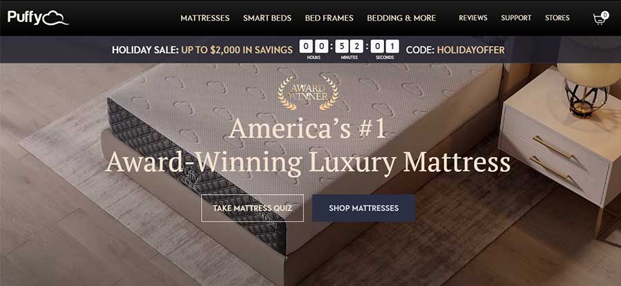
The problem lies in displaying time-based promotional messages after a user has navigated.
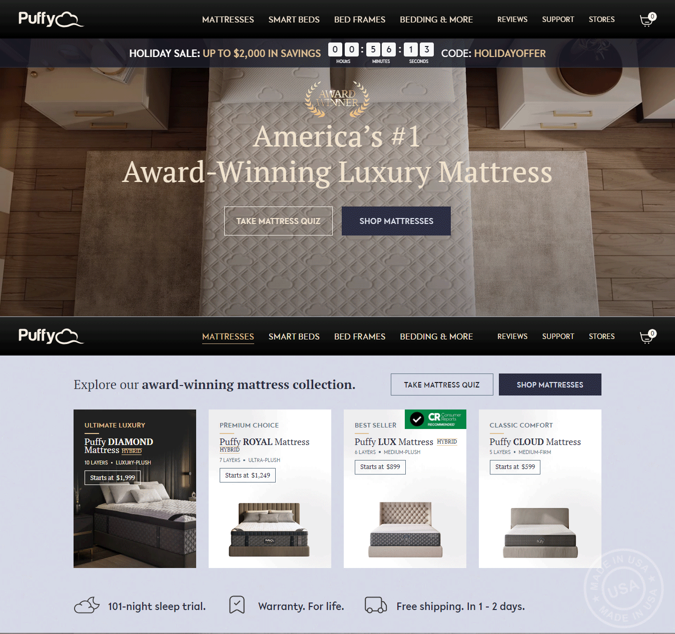
When I hover my mouse over any link item as a user, it triggers the mega menu, concealing the time-sensitive promotion message during this interaction.
According to UX guidelines, the promotional message must remain consistently visible on the website and should not be obscured by any user activity.
Let’s examine how other websites handle the display of promotional messages on their platforms.
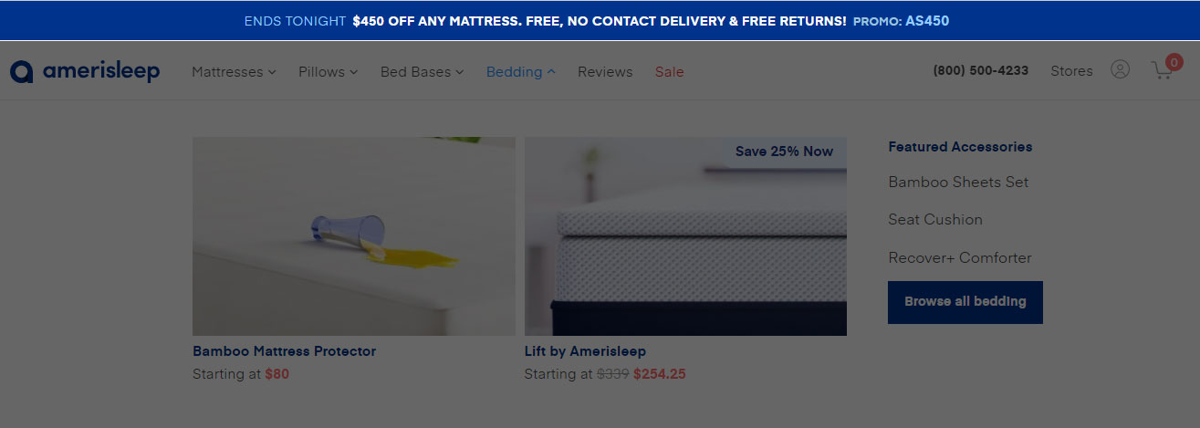
Ref : www.amerisleep.com
Amerisleep and puffy.com operate within the same industry, both prominently featuring their promotional messages at the top as the primary UI element.
Although this is a minor issue, its impact can be significant. Let’s explore how we can address and resolve this issue.
The solution is straightforward. Despite being a minor issue, it significantly affects the user flow. The remedy is to move the promotional message to the top as the first UI element on the website and maintain consistency throughout the entire site.
Here, you can see before and after comparison
Note
Consider AB testing to determine the most effective option, prioritizing improved conversion rather than random clicks.


