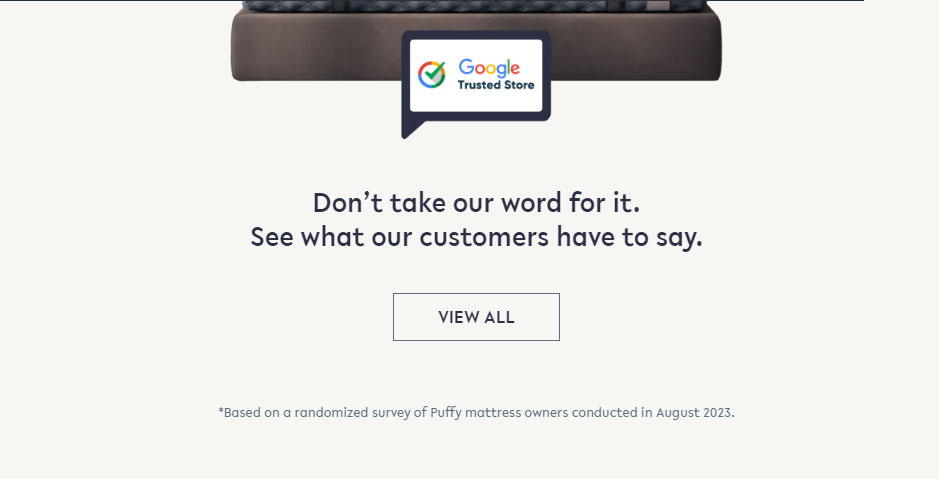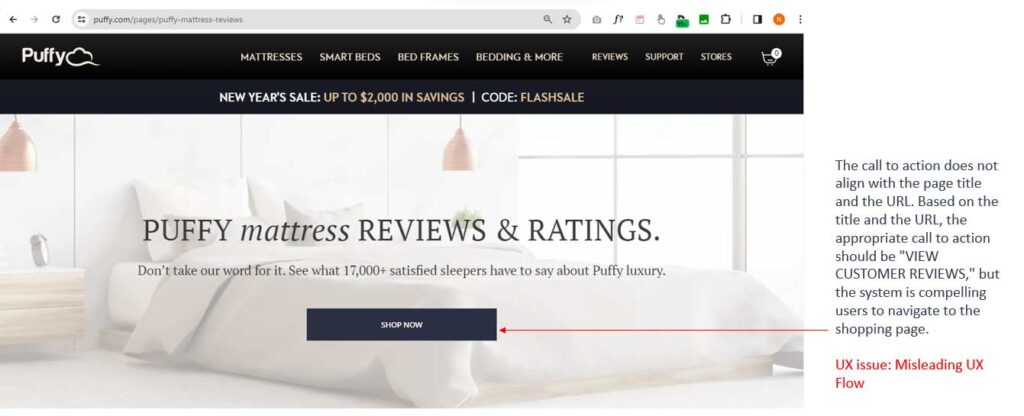
I’m Neeraj Aneja, a UX designer, UX researcher, and Product Designer based in Bangalore. I’d like to discuss the Customer Review page on Puffy.com. As a user, when I visit the customer review page, there are no customer reviews visible in the initial view of the page. Additionally, there is no apparent call to action guiding me to access customer reviews. Instead, the system is directing me to the Shop page, creating a misleading UX flow. My intention was to explore customer reviews, and the current system isn’t aligning with that user expectation.
Problem : Misleading UX
Problem Statement : As a user I am not able to see the customer testimonials even after click on the link.
How to solve? Correct the user flow.
Success Criteria : How many people bought the mattress after seeing the customer reviews.
Step 1

Upon clicking the “View All” button, the system presents the following screen. Notably, no reviews are visible in the initial view of the landing page; users need to scroll to access them.
Step 2

Upon reaching this page, users are unable to immediately view any testimonials, despite their intention to do so after navigating from the home page. The absence of testimonials in the initial view creates a misleading user experience, necessitating scrolling to access them. To enhance the user flow, it is advisable to showcase 3 or 4 testimonials in a carousel format along with a prominent “SHOP NOW” call to action.


