Noon.com, based in Dubai, operates as an e-commerce platform with over 25,000 web pages. In this assessment, we will examine various aspects of the website, including user interface, consistency, cross-platform and cross-browser compatibility, content analysis, competitor analysis, error handling, and messaging. Presently, the noon.com website appears crowded, featuring numerous categories and products.
Note : The assessment is conducted using the VIMM Model and principles of Heuristic evaluation.
———————-
Product Growth Opportunities in Noon.com
Website: www.noon.com Category: Ecommerce Location: UAE Number of Pages: 25,000+ Home Page Height: 14,540 pixels Sections on the Home Page include:
- More Reasons to Shop
- Mega Deals
- In Focus
- Recommended for You
- Countdown
- Best Deals for You
- Deals Only on Noon
- Trending Deals in TV and Accessories
- Clearance Deals
- And Much More
——————————-
Let’s take a closer look at the initial view on the noon website.
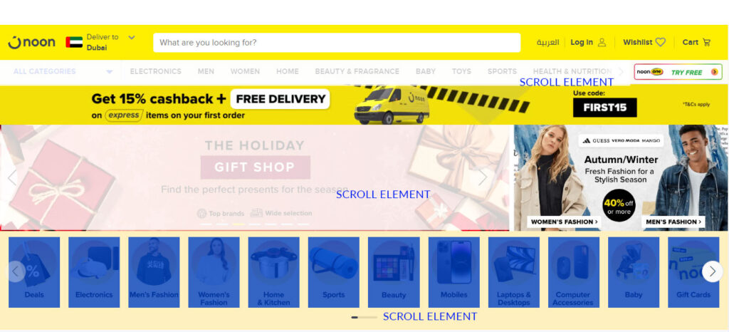
- This represents the top section of the noon.com website’s page. Beneath the slider, category names are presented in graphical format rather than as text. Since these category names are displayed as images, the browser cannot display the accompanying text below each graphic. This results in a less user-friendly experience.
- The left and right arrows are overlapping the images, potentially making it challenging for users to click on them.
- The system is displaying an excessive number of images, making it difficult for me as a user to focus on any specific section.
- The system is presenting multiple scrollable sections in the initial fold of the page, which is not conducive to a user-friendly experience.
Visual Load:
The excessive use of yellow color is adding to the visual load on the website. The system is presenting an abundance of information, leading to a cluttered appearance and heightened visual load for the user.
Motor Load:
The slider in the Hero Section, Navigation, and Category section is contributing to an increased motor load. Users are required to utilize the slider feature to access hidden information. The right arrow in the primary navigation is not easily noticeable to the user.
Lets Review Amazon.com UI ( First fold of the page )
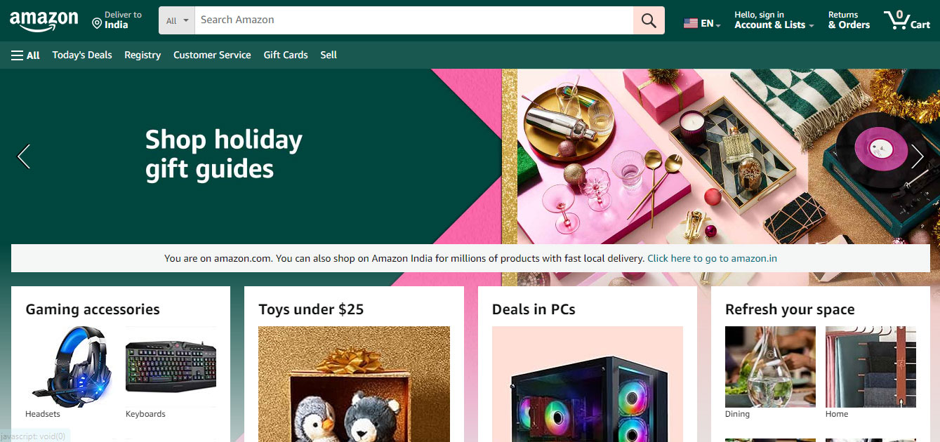
– Amazon.com exhibits a sleek, orderly, and highly user-friendly interface.
– The website features a singular slider section, eliminating multiple distractions for users.
– Amazon’s navigation is transparent, lacking hidden links.
– The initial fold of Amazon’s page is cleaner compared to that of Noon.com.
– Amazon employs text-based category names, while Noon uses image-based categories.
However, on Amazon, the crucial links “Bestsellers” and “Sell on Noon” are not immediately visible to users; one must scroll within the navigation to locate these links.
Mega Menu in Noon
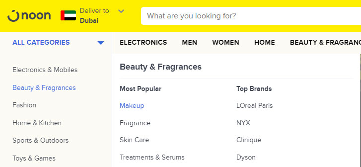
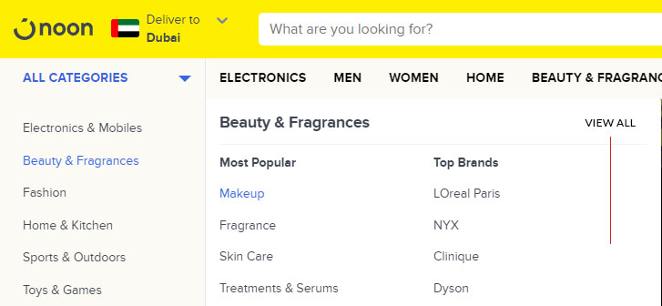
The mega menu in noon must display “VIEW ALL” link as a first link in each section.
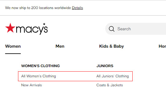
Mega Menu in Macys
For examples the website Macys.com is also showing “View all” link as the first element in the navigation system.
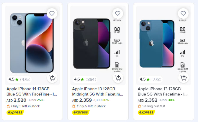
Product Cards improvements in Noon
Improvements required in product card.
In the existing layout, the pricing information is not easily visible to the user. This is due to its placement not being the primary element in the product card. The arrangement of title, pricing, and badge in the same location complicates the readability and scanning of the product card. To enhance conversion rates, it is advisable to strategically organize all elements based on user preferences.
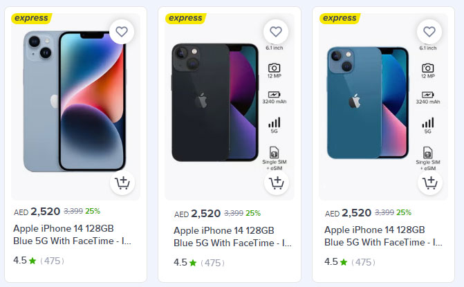
Improvement Required in product card design. (Just an Idea)
The user’s main focus is on delivery and pricing information. Place express delivery prominently at the top of the image for immediate visibility. Ensure that pricing details take precedence as the initial element in the UI card. To optimize user experience and conversion rates, introduce some spacing between the UI elements within this product card.
Example of recommended product card design
Product Detail page of Noon.com
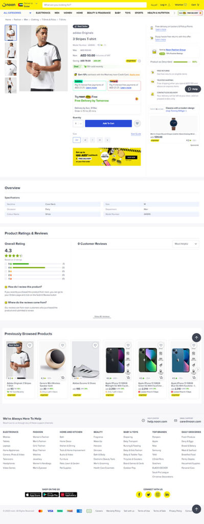 PDP page is missing these elements. For the noon.com product growth, Impliment these functions in the PDP page.
– Product bundle
– Recently viewed products
– Frequently bought together
– Featured Products
– SEO Footer Text.


