Motor load in user experience refers to the extent to which users need to frequently use scroll bars or mouse actions to access information. This concept is a part of the VIMM Model in UX and is responsible for a significant portion of usability issues, accounting for approximately 60%.
Identifying motor load issues on a website
Identifying motor load issues on a website includes recognizing scenarios such as horizontal scrolling for information access, vertical scrolling for a small amount of data within a specific group, excessive clicking, small targets or CTAs, and distant placement of call-to-action elements.
How Puffy home page is disturbing user flow?

What is causing an increase in motor load within the UI section of the Puffy Website?
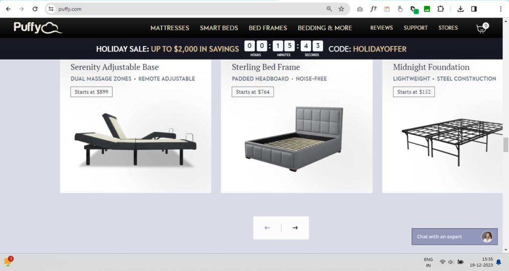
On Puffy’s homepage, the section titled “Explore our award-winning mattress collection” presents a challenge to users. The title, product images/cards, and arrow icons for scrolling left and right are not visible in a single frame. This necessitates continuous vertical scrolling, causing an increase in motor load.

Upon scrolling down to view the arrows, users are unable to see the top information. Consequently, users need to scroll back up to access the upper content.
As a user, the issue arises when attempting to view the title and product images together, as the arrow icons are not visible. Scrolling down to locate the arrows results in the loss of visibility for the product images and associated text. This repeated need for vertical scrolling adds to the motor load, negatively impacting the user experience.
How to solve Motor Load UX issue on Puffy home page?
To address this issue, a solution would be to present all three elements—title, product images/cards, and arrow icons—in a single frame. Reducing the height of the images or placing the arrows on the right and left sides of the section can help users access information without excessive scrolling.
In conclusion, while seemingly minor, this motor load issue disrupts the user flow and can lead to user frustration when trying to access information on the Puffy homepage. Resolving this matter is crucial for enhancing the overall user experience.


