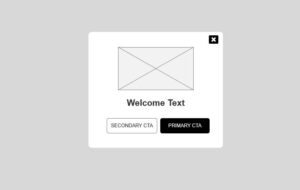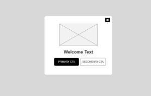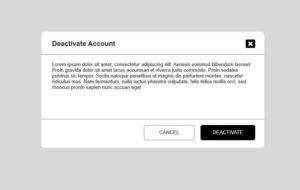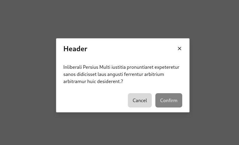
Modals are UI components that appear on top of an application window or web page. They typically use a semi-transparent background to allow users to glimpse the underlying content while focusing on the modal itself.
Uses of Modals
Important announcements
Highlighting critical information that demands user attention.
Warnings, alerts, and confirmations
Prompting users for crucial decisions or informing them about potential risks.
Video and image displays
Presenting media content in a dedicated space without affecting the main page layout.
Long operations and loading indicators
Keeping users informed about ongoing tasks, especially for slower processes.
Irreversible actions
Seeking user confirmation for actions that cannot be undone.
Additional information
Displaying product details, user profiles, or other supplementary content conveniently.
Step-by-step tasks
Guiding users through multi-step processes efficiently.
Elements of Modal Window
– Title
– Close Button
– Content
– Primary CTA ( Save / Submit )
– Secondary CTA ( Cancel )
How to Make modal mobile accessible?
– Make all clickable actions accessible via keyboard navigation.
– Allow users to close the modal using the Escape key.
– Enable tab and Enter key functionality for easy option selection.


