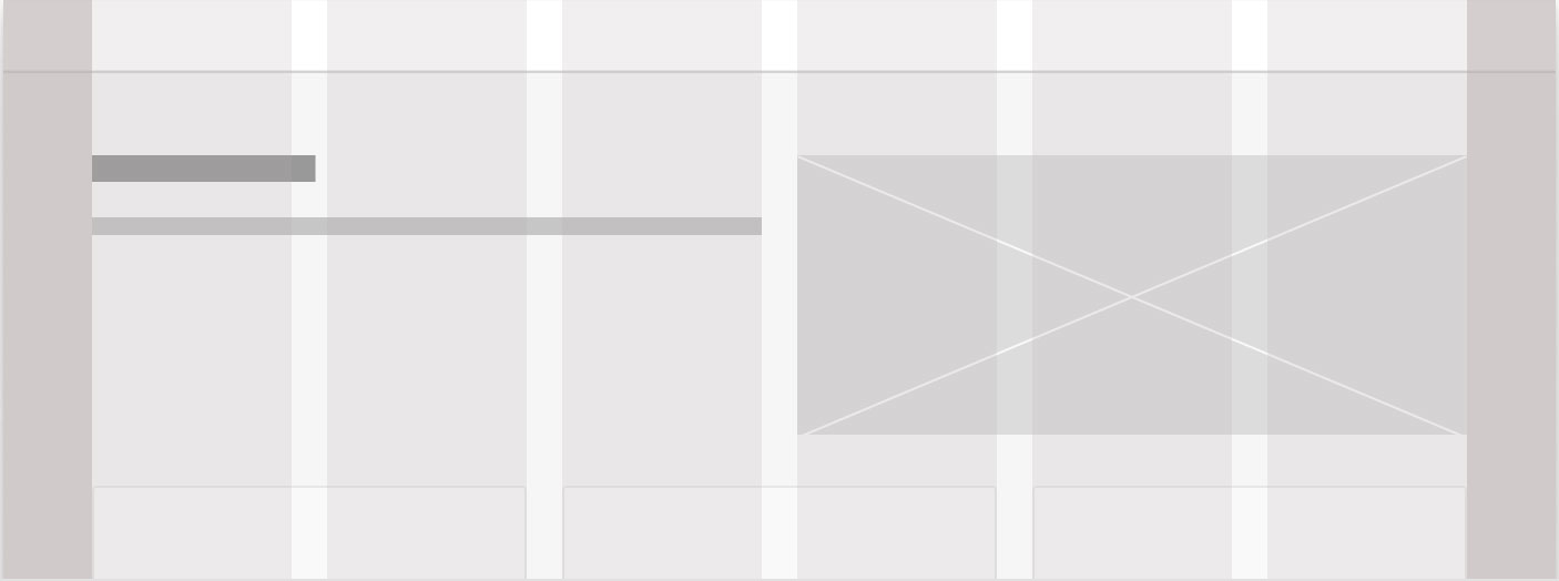
In user interface design, a grid system is a structure of vertical lines that divide a page into equal columns of 12 for desktop and 4 for mobile. Grid System framework is one of the most outstanding ways of making a predictable design with equivalent separating and legitimate arrangement. It aids in the creation of relationships between UI elements, linking various design elements, and establishing a hierarchy.
A 12-column grid’s hidden design framework is crucial for bringing various design elements together in a cohesive way. It offers fashioners an instrument to lay out visual progressive system and arrangement, accomplished through a bunch of intangible (or on occasion noticeable) vertical lines that segment the screen into 12 unmistakable sections.
Advantages of the Grid System:
– It helps to align the UI components in a structured way.
– It also helps to maintain consistency and equal spacing.
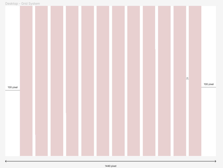
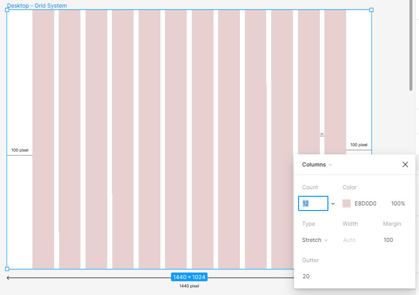
Desktop Grid System Setting in Figma
Artboard width : 1440 pixel
Left Edge : 100 pixel
Right Edge : 100 pixel
Columns : 12
Spacing : 20 pixel
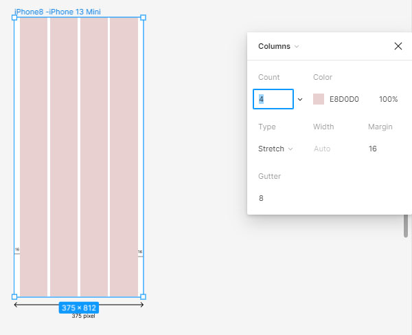
Mobile View Grid System Setting in Figma
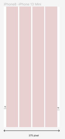
Mobile View Grid Specification
12 Column Grid

2 Column Grid


