We all know forms are used to collect user data, but designing good ones isn’t a cakewalk. They should be simple and straightforward for users to navigate.
Let’s dive into the crucial elements of a good form:
Labels
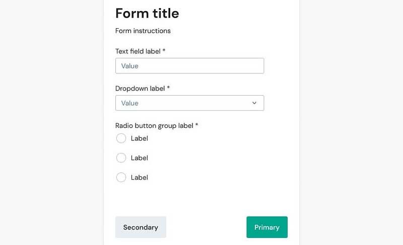
Keep them clear and always visible. Users shouldn’t be left guessing what they’re filling in.
Input Fields
These are the vessels for user data. Choose the right type for each field (email, text, etc.).
Placeholder Text
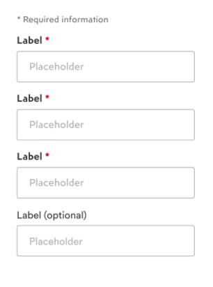
Offer subtle hints within the fields to guide users without replacing clear labels.
Mandatory vs. Optional
Use asterisks (*) to mark required fields, helping users prioritize completion.

Strong CTAs
Make the primary action (“Submit”) prominent and actionable. Offer a secondary CTA (“Cancel”) for graceful exits.
Error Messages:
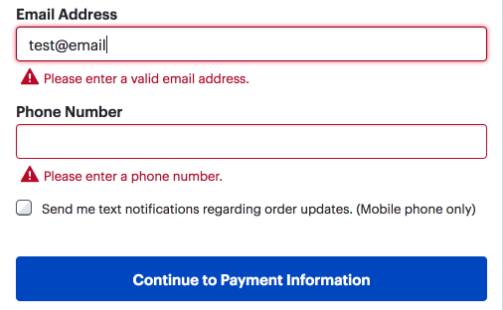
Display them directly below the offending field, using clear language and actionable solutions. Red highlighting helps them stand out.

Data Planning
Before building, define the exact data you need. Categorize fields into logical segments for user ease.
By following these principles, you can craft forms that users will actually enjoy filling out, ultimately enhancing your data collection experience.


