Buttons are the most important elements of any website. Every section of a website should have at least one button. Buttons are used to complete actions such as adding products to carts, making payments, buying movie tickets, and more. They allow users to perform all of the important actions on a website.

Primary, Secondary and Teritary Buttons
Primary -Contained button (high emphasis)
Contained buttons have more emphasis, as they use a color fill and shadow.
Outlined Button (medium emphasis)
Outlined buttons are used for more emphasis than text buttons due to the stroke.
Text button (low emphasis)
Text buttons are typically used for less important actions.
Rules for Defining Buttons:
– Buttons should be easily identifiable.
– They should be easily findable by users on the page.
– The action of the button must be clear to the user.
Types of Buttons:
Filled buttons: These buttons are designed to get the user’s attention.
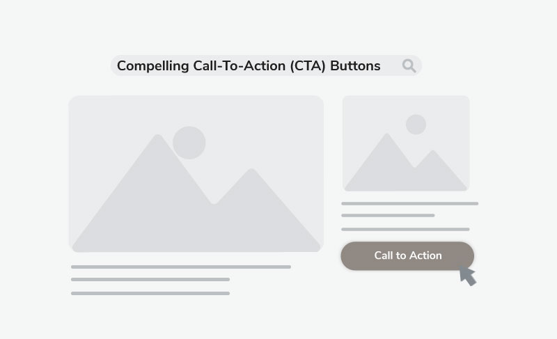
– CTA (Call to Action) buttons: These buttons are similar to filled buttons, but they are specifically used to encourage users to take a particular action.
– Floating buttons: These buttons float on the screen and were introduced by Google’s Material Design.
– Toggle buttons: These buttons allow users to switch between two states, such as “on” and “off.”
– Icon buttons: These buttons have an icon that can be located on the left or right side of the text, depending on the action to be taken and how best to represent it.
Anatomy of a Button:
The anatomy of a button is very simple
Text: The text inside the button should clearly convey its purpose.
Padding: The button should have enough horizontal and vertical padding to make it easy to click.
Border radius: The border radius of the button can be rounded or sharp, depending on the visual hierarchy or brand guidelines. Rounded corners are often used for playful designs, while sharp corners are used for more sophisticated designs.
Button States
Button states should be easily distinguishable by the user. However, it is important to avoid making major changes to the design of the button when it is in different states.
The different button states include:
– Normal
– Hover
– Active
– Disabled
– Focused
– Progress
Here’s the text with corrected grammar:
Buttons: The Most Important Elements of Any Website
Every section of a website should have at least one button. Buttons are used to complete actions such as adding products to carts, making payments, buying movie tickets, and more. They allow users to perform all of the important actions on a website.
Rules for Defining Buttons:
Buttons should be easily identifiable.
They should be easily findable by users on the page.
The action of the button must be clear to the user.
Types of Buttons:
Filled buttons: These buttons are designed to get the user’s attention.
CTA (Call to Action) buttons: These buttons are similar to filled buttons, but they are specifically used to encourage users to take a particular action.
Floating buttons: These buttons float on the screen and were introduced by Google’s Material Design.
Toggle buttons: These buttons allow users to switch between two states, such as “on” and “off.”
Icon buttons: These buttons have an icon that can be located on the left or right side of the text, depending on the action to be taken and how best to represent it.
Anatomy of a Button:
The anatomy of a button is very simple:
Text: The text inside the button should clearly convey its purpose.
Padding: The button should have enough horizontal and vertical padding to make it easy to click.
Border Radius: The border radius of the button can be rounded or sharp, depending on the visual hierarchy or brand guidelines. Rounded corners are often used for playful designs, while sharp corners are used for more sophisticated designs.
Button States: Button states should be easily distinguishable by the user. However, it is important to avoid making major changes to the design of the button when it is in different states. The different button states include:
Normal
Hover
Active
Disabled
Focused
Progress
Use of Icons in Buttons
It is recommended to place icons before the text in buttons. Placing icons after the text often does not serve any purpose.

Strong CTAs buttons
If you want users to take a specific action, you need to guide them in a simple way. Use clear and concise language on the button so that users can easily understand the call to action. Make it clear to the user what they need to do, instead of leaving them guessing.


