Carrefouruae website user experience improvements

Hello, I’m Neeraj Aneja, and I bring over a decade of experience in User Experience and Product Design within the ecommerce sector. Over the years, I’ve assisted numerous ecommerce clients in enhancing their user flows and overall UX journeys. My expertise extends beyond addressing major UX issues; I also pay attention to the finer details often overlooked by stakeholders and developers.
Now, let’s direct our attention to the https://www.carrefouruae.com/mafuae/en/ website and identify the necessary UX and usability improvements needed on the platform.

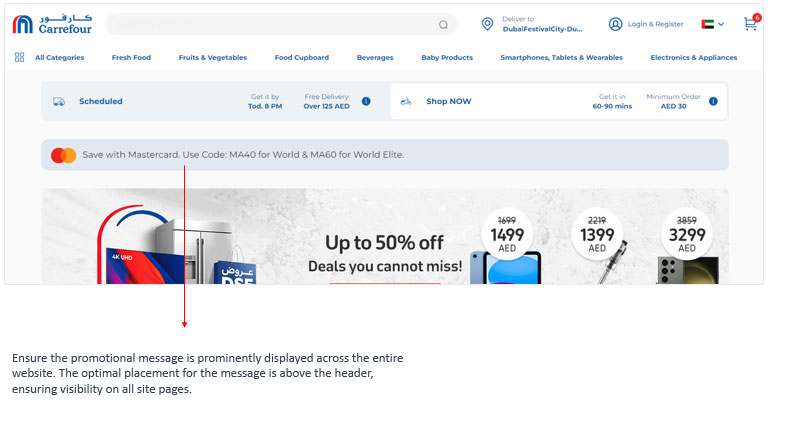
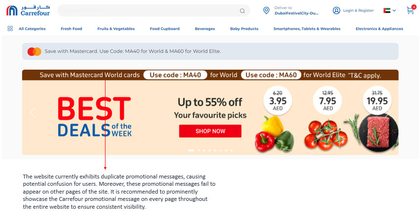
The positioning of the promotional message on the Carrefour UAE website requires improvement.

Carrefouruae website user experience improvements

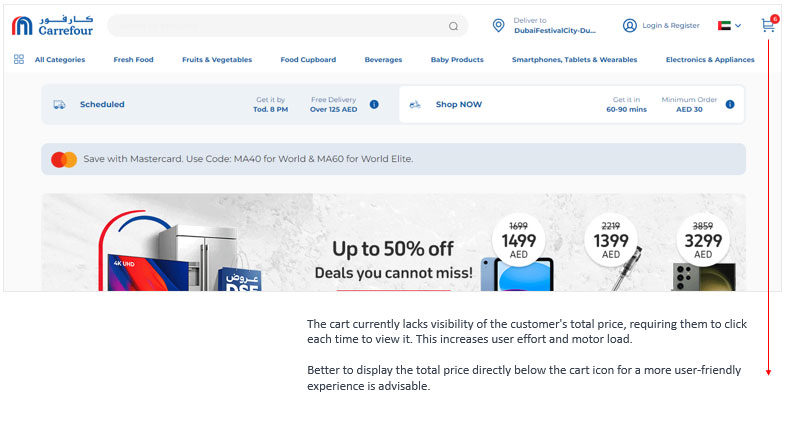
The cart icon in the Carrefour website header is not displaying the total amount.

Carrefouruae website UX improvements

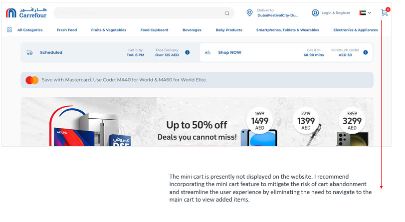
The mini cart is currently unavailable on the Carrefour UAE website.

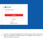
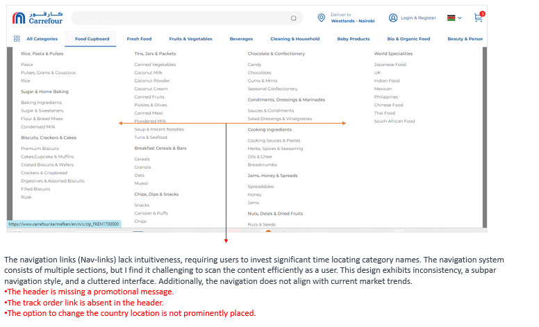
The user is confused or disoriented on this screen.

Promotional message is not displaying at prominent place

Promotional message is not displaying at prominent place

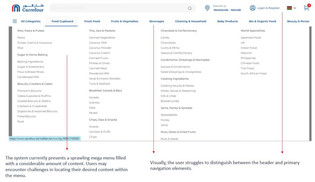
Struggles to distinguish between the header and primary navigation elements.

Neeraj Aneja

I am Neeraj Aneja, a UX, UI, and Product designer based in Bangalore, specializing in UX and UI. I adeptly craft seamless experiences for both B2B and B2C projects. With a focus on innovation and user-centric design, I strive to elevate brands through intuitive interfaces and optimized workflows.

Related Posts

© 2024 NEERAJ ANEJA | UX Researcher / Product Designer in Bangalore | Mob : 9990333926