One of the most important components of user interface (UI) design are buttons. They act as the main method of communication between the user and the computer programme or website. A button may be used to start an action, switch to another page, or submit a form, among other things. Learn more about Buttons in user interface design in this article.
We’ll look closely at buttons in UI design in this blog post. We’ll look at various button designs, design components, and usage and placement guidelines. This guide will assist you in designing efficient and approachable buttons for your applications or websites, regardless of your level of UI design expertise
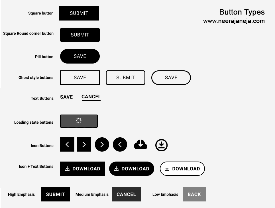
Types of buttons

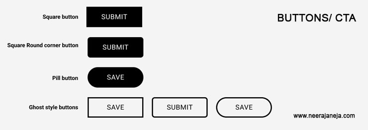
- Square button
- Pill buttons
- Ghost buttons
- Text buttons
- Loading state buttons
- Icon only buttons
- Icon with text button
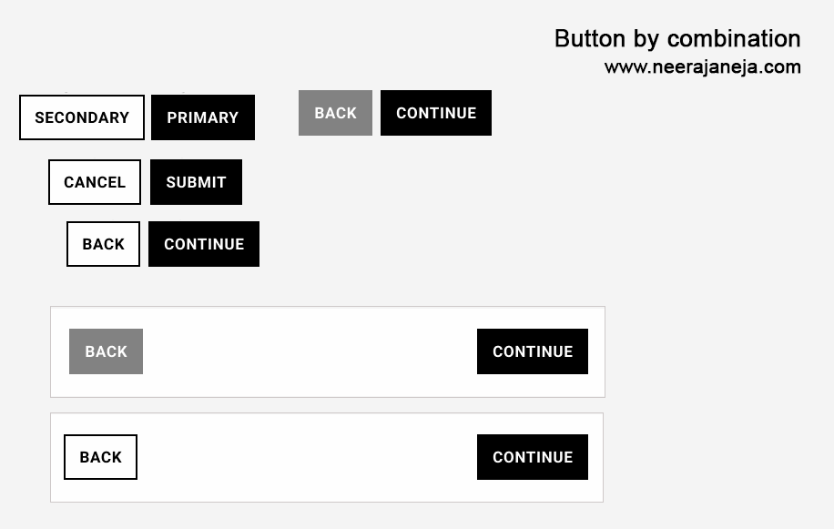
Buttons by combination

- Secondary and Primary buttons
- Stacked buttons
Buttons By Emphasis

- High emphasis buttons
- Medium Emphasis buttons
- Low Emphasis buttons
Button States
- Default state button
- Hover state button
- Pressed state button
- Focused state button
- Disabled state button
When creating buttons, it’s important to follow these guidelines:
- Use one or two word (Max 3 words) in button. Do not use more than 3 words in button. It is difficult to scan for the user.
- In “icon with text button” , use only one icon per button.
- Place secondary link on the left side or below the primary button.
- Use fill color button when placed on the image.
- use text in one line in the button.
Place Ghost button on the left side of the primary button. - If you are keeping button one above the other , use the same width.
By following these guidelines, UI designers can create effective and user-friendly buttons for their applications or websites.


