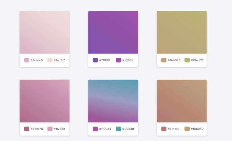
Designing a gradient involves creating a visual effect where colors blend seamlessly into each other. By incorporating a gradient, the overall appearance of a UI component is enhanced compared to using a single solid color.
Type of Gradient
How to use Gradient in UI?
– On a carousel background with text overlaid.
– On buttons and calls to action to make them more impactful.
– Don’t add a gradient unless it’s necessary.
– It’s specifically used to add depth to the UI component.
Gradient Generator tools
To simplify the process of creating gradients, there are several online Gradient Generator tools available:
1. Coolors Gradient (https://coolors.co/gradients)
2. Mesh Gradient (https://meshgradient.com/)
3. UI Gradients (https://uigradients.com/)
4. CSS Gradient (https://cssgradient.io/)
5. Josh Comeau’s Gradient Generator (https://www.joshwcomeau.com/gradient-generator/)
These tools provide convenient options for generating gradients, allowing designers to achieve the desired visual effect effortlessly.


